Hollywood Hills / Los Angeles, California

Overview
The project is presented here as a take on classical mythology.
Welcome to the home of Anthony and Apollo.
Names have been altered to protect the innocent.
This love story begins within a 1925 Spanish home nestled within the Hollywood Hills. The home is designed as a “Colour Portrait” that reflects the temperaments of our fabled couple. Our temperaments—written into our DNA—tell us how much stimulation (colour, light, sound, touch) we need to feel comfortable and at ease. Through our interactive “Colour Play” process, we learned which colors spoke to Anthony’s and Apollo’s personalities, souls, and desires, which became the creation of their “Primal” colour palettes specific to Anthony and Apollo.
Starting from the primal palettes, we Gillian Rose Colour created an experiential sequence of colour and space—a harmonious palette of carefully selected shades flows from one space to the next, creating environments that reflect and extend Anthony’s and Apollo’s unique temperaments.. The final result reflects who the clients are, and how they wish to feel at home.
Anthony required softer and cooler colours to achieve inner balance. Apollo, on the other hand, required more stimulation—his palette consisted of strong colours with high contrast to create his own sense of ease and balance.
The design begins at the front gate. A custom pale green contrasts the light pink stucco of the original residence while seamlessly blending into the lush plantings around the house. The colour is called Capri, after the place they consider their second home.


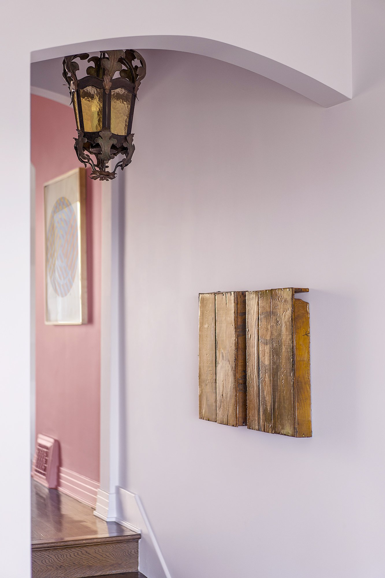
Image © Manolo Langis
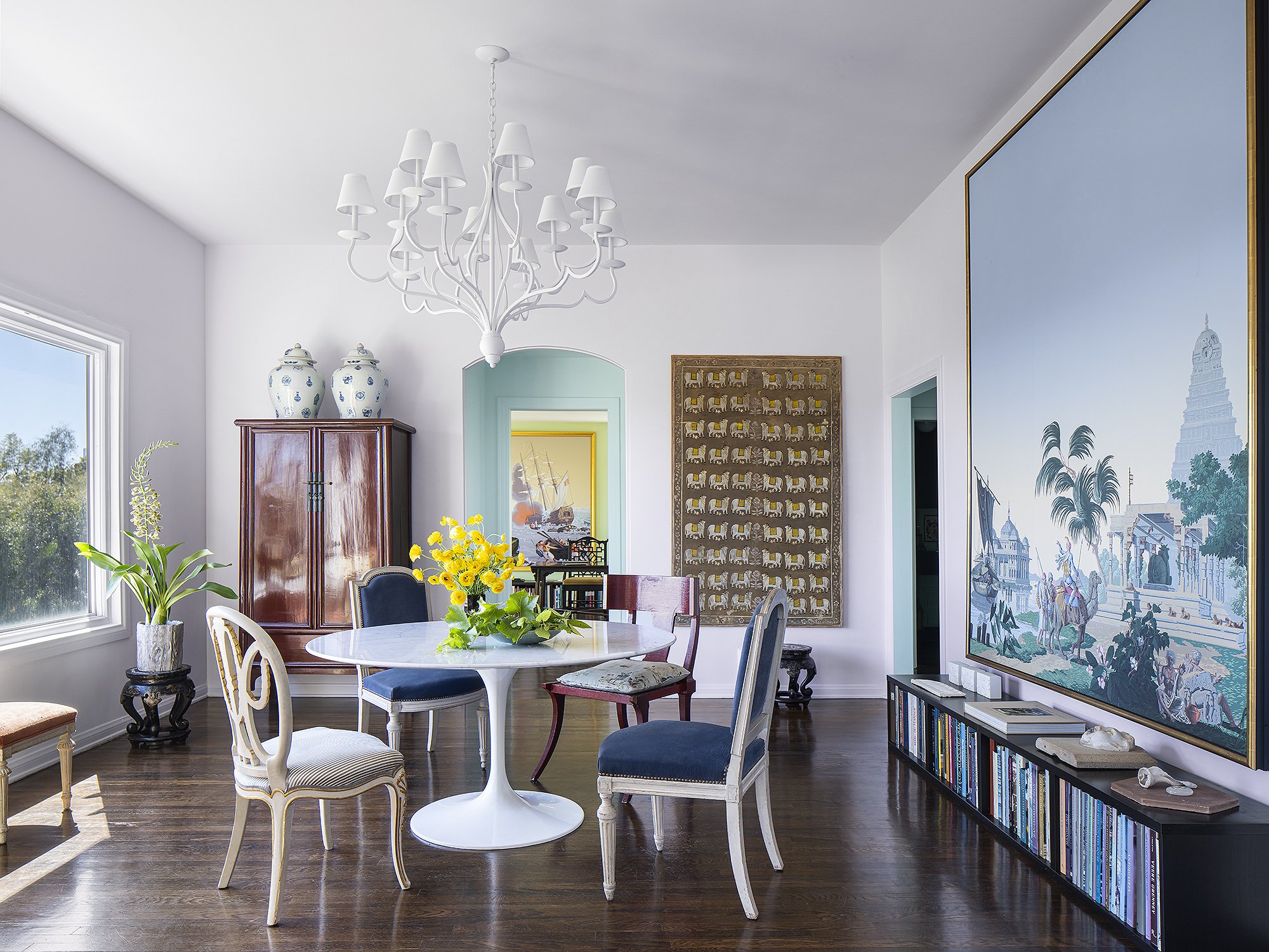
Image © Manolo Langis

Image © Manolo Langis

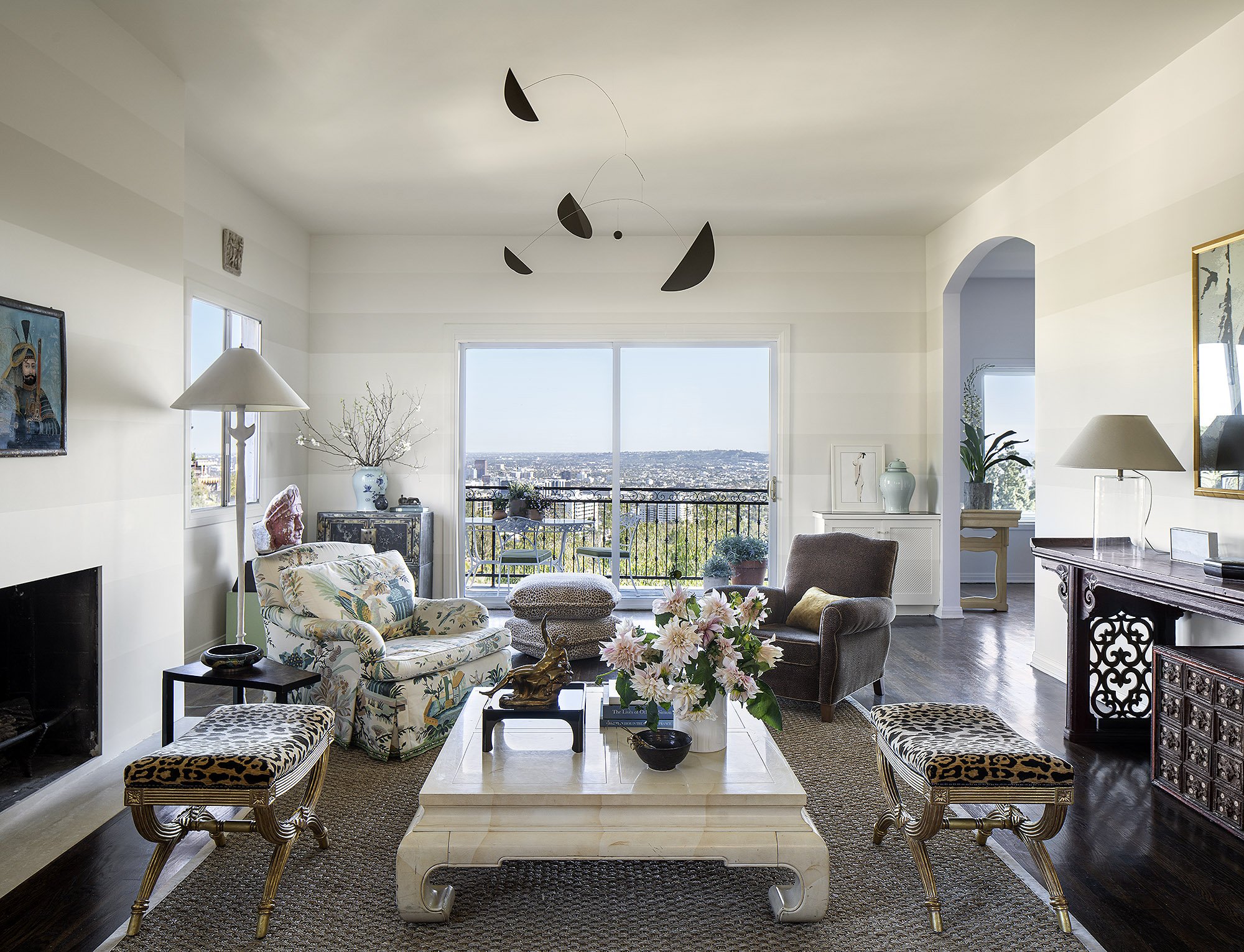
Image © Manolo Langis
The interior experience of the home begins with the foyer, which blends Anthony’s and Apollo’s temperaments. An antique mirror in the space is encased in a soft taupe shade called Fawn, contrasting a deep, dusty rose feature color called Blanche Dubois Rose, which gives the space a soft vibrant warmth. The ceiling is painted in a light shade called Whistler Blackcomb, which visually expands the space beyond its confines.
The Grand Salon ( the main living space ) reflects the clients’ unique personalities. The soft tri-colour horizontal stripes reflect Anthony’s introverted nature as well as his love of 1930s French interior design and all things Deco. The striped patterning creates contrast—vibrational stimulation—that reflects Apollo’s approach to life. The space reflects and balances the needs of our couple. A blush of warmth—the dusty pink of the foyer—is visible from the Salon, creating a subtly vibrant contrast that which streams rays of energy to the room.
The arched entryways between the interior spaces serve as color “palate cleansers” that prepare one to move seamlessly between colour zones.
The dining space is unified by an icy lavender shade called Delicious, which gives personality and allows the space to recede to emphasize the life and activity within. The ceiling, covered in a lighter shade called Divina, creates a sense of openness and possibility. The dining room reflects both Anthony and Apollo and promotes a blissful domestic life without overpowering the space. The dining offers a giant picture window creating a sense of eating outdoors.

Image © Manolo Langis
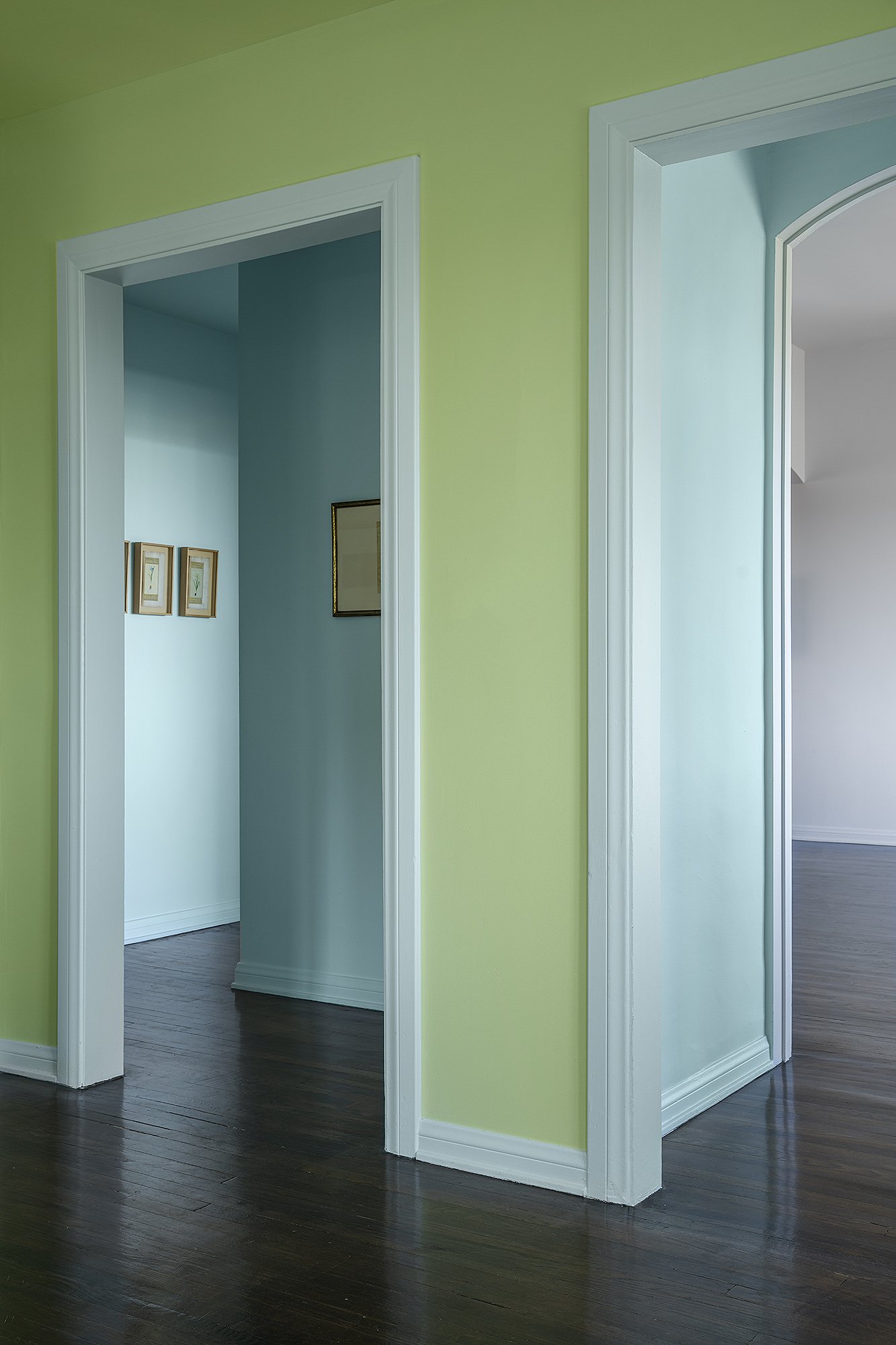
Image © Manolo Langis

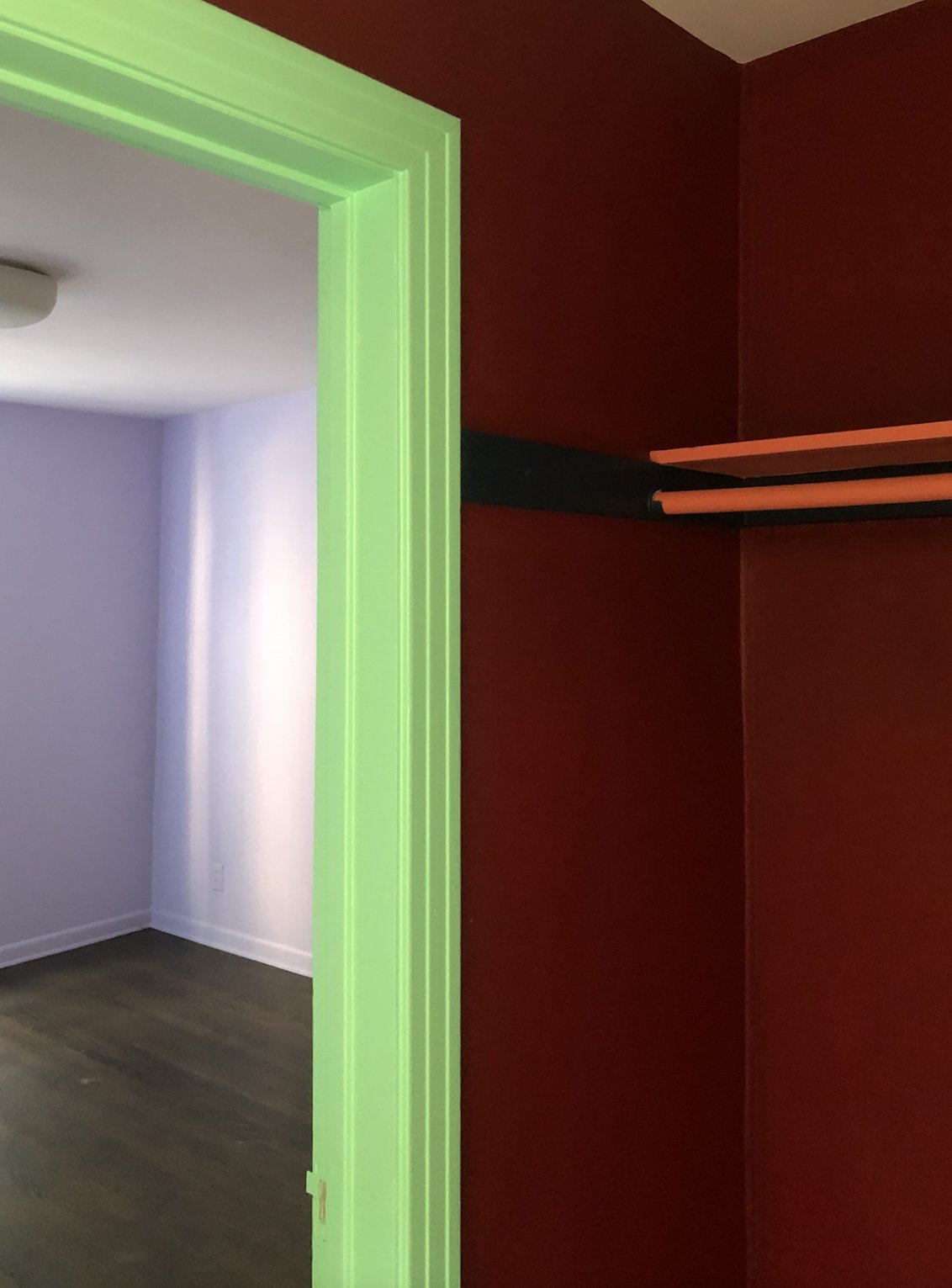
Image © Manolo Langis
The arch leading from the Great Salon to the office is painted in a pale aqua called Atmosphere, which creates a soft transition, another palette cleaner between the two adjoining rooms. Just beyond, the office—designed for Apollo—is defined by a fresh, bold, green shade called Teenager supporting conducive to Apollo’s personality and work style. Transitions between these domestic spaces of the house evoke the feeling of being in a Laduree’s patisserie, inviting us to step into a time of peace and tranquility.
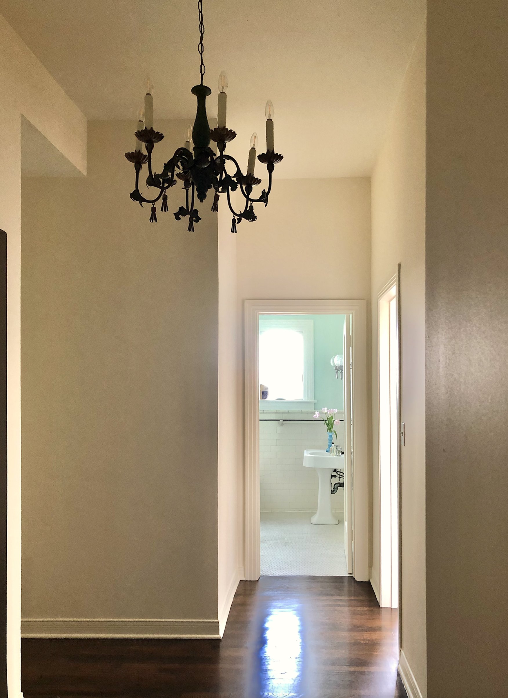
The powder room and bar, are defined by bold color. Each one is designed around intense palettes that reflect and support their purpose. The powder room is enveloped in a sensual vermilion called Silk Taffeta, creating a playful backdrop for the client’s menagerie of monkey sculptures and prints. The bar space (designed to conjure New York’s famous Bemelmans’s Bar) is encased in a saturated blue—Lahey Sky—supported by a dreamy cool green called Monet, creating the sense that nature extends beyond the walls.
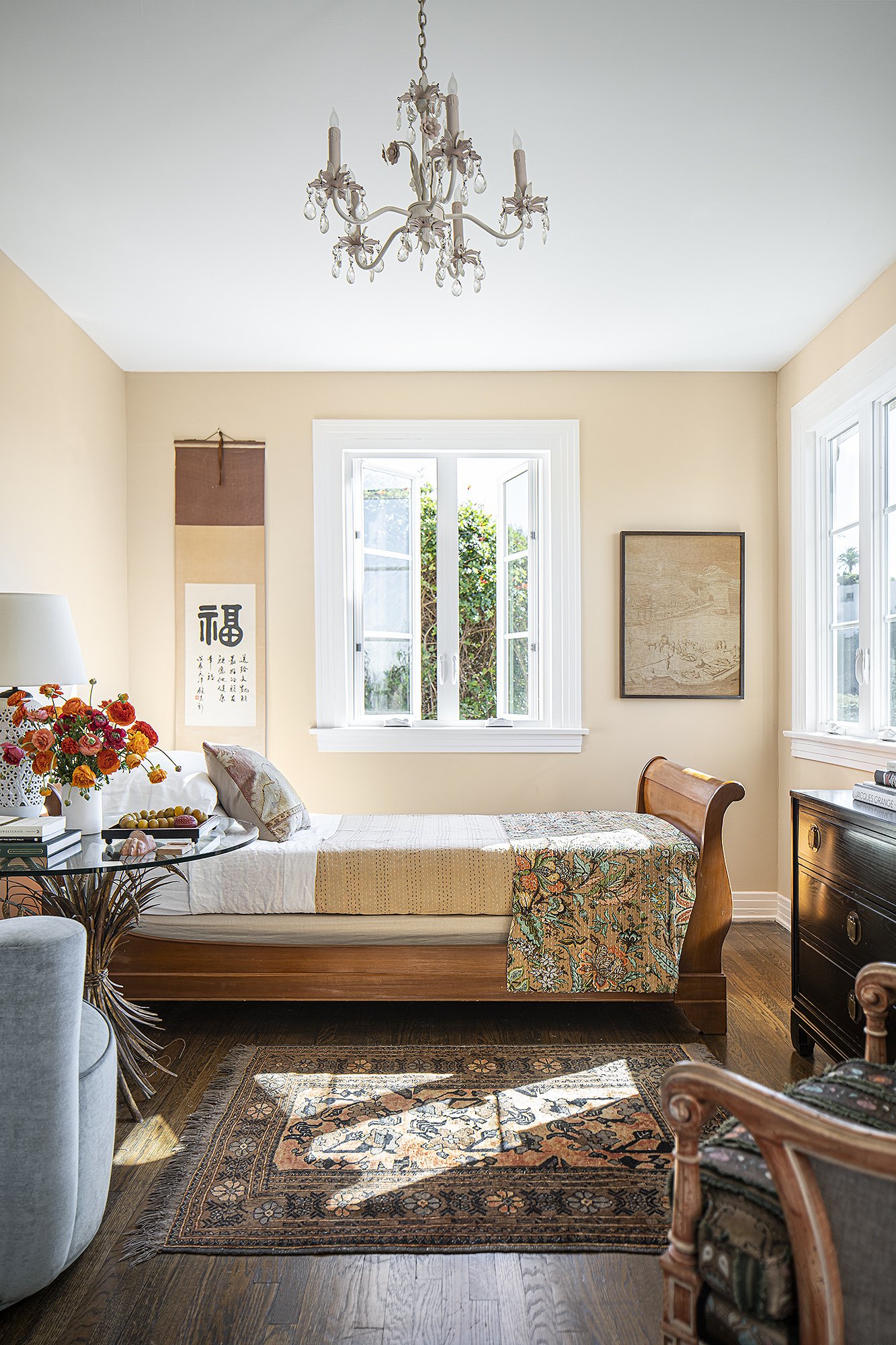
Image © Manolo Langis


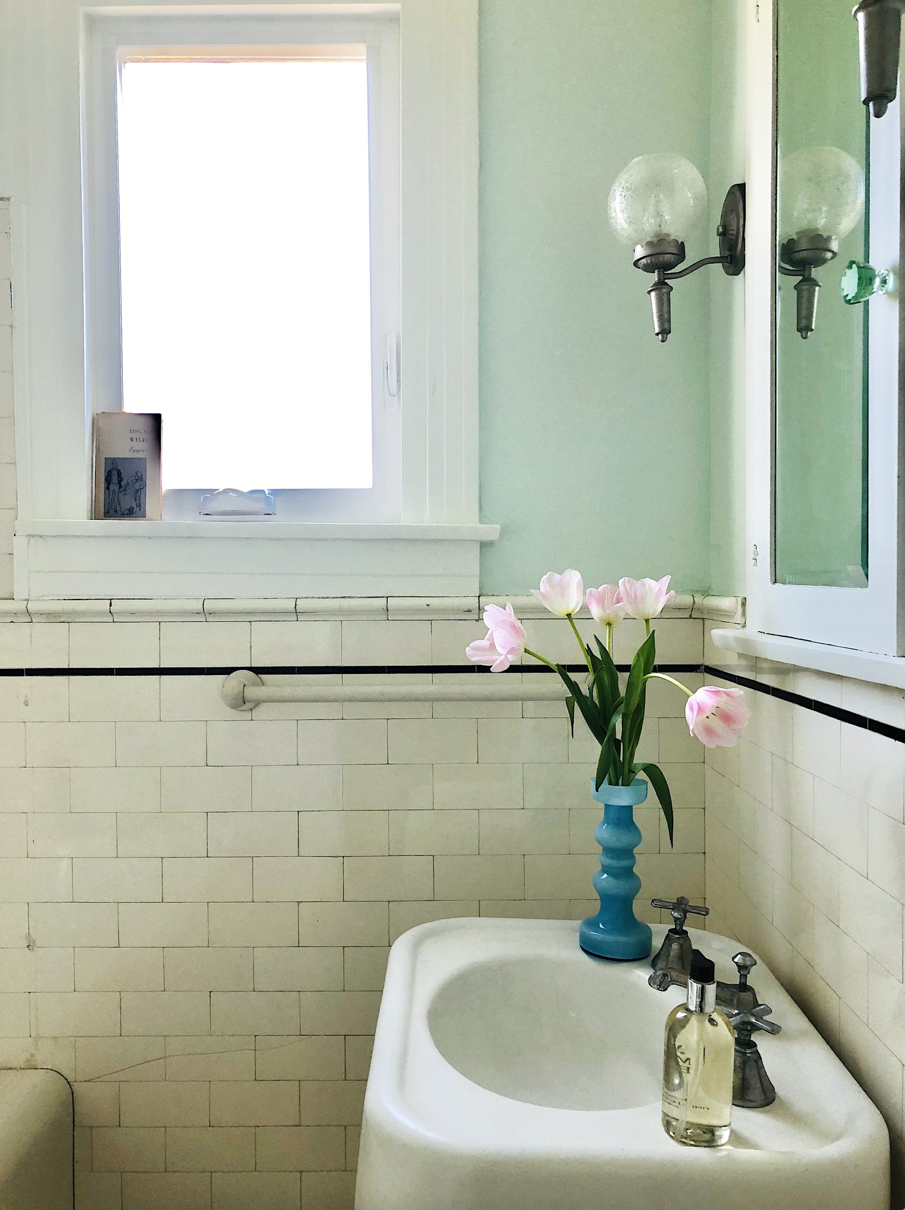
Because of the lower grade of the private sleeping floors, they have an even greater foliage refection. We went with a less saturated color palette.
Guest bedroom #1, took on the personality of Medieval Florence, being painted in a custom color Sienna, with a gesture reminiscent of Mamie’s red petticoat, the closet became cloaked in custom color, Pink Revolution.
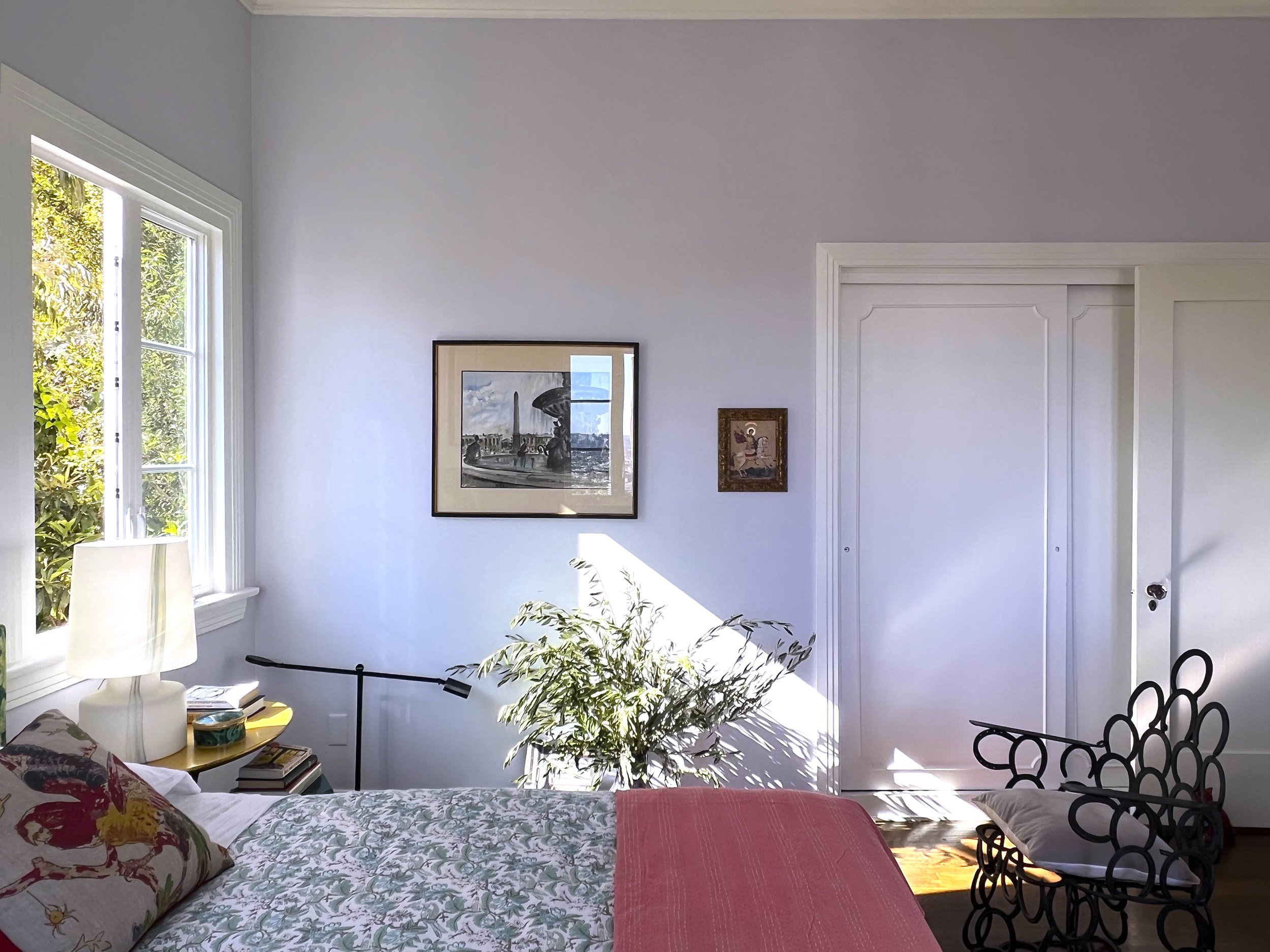
While each of the 5 bedrooms has its own distinct personality and colour story, we will focus on the Master Bedroom
The Master Bedroom was designed to be as serene as it is beautiful, there is so much more going on in here, than simply, beauty.
The color palette reflects Anthony’s need for serenity and less stimulation. Evoking the feeling of being within a cocoon and the ultimate treehouse.
The paint colours shown here on the walls: I Do. The trim and ceiling colour had to be a custom creamy white, to counterbalance the reflections, flooding in from the vibrant greens of the surrounding foliage.

Purely based on our fabled couple, we created a palette of 40 colours, and each one is intentionally woven into the experience of their home. This palette simply reflects how our clients wish to live, interact, and enhance the lives they have lovingly built together.
This maquette shows the colors and the order in which you would encounter them as you move about this truly unique home.
Not many things in the world are solely about “us” ~ but our own individual responses to colour, certainly are.