Gillian Rose Colour, Premier Colour Collection
Premier Colour Collection is our initial paint color collection of 48 full-spectrum colours designed to capture a full range of emotions.
“You’re the only one applying science to create personalized colour palettes. You are the future, and we want to be with you.”
John Lahey, Jr.
CEO and Founder, Fine Paints of Europe™
.
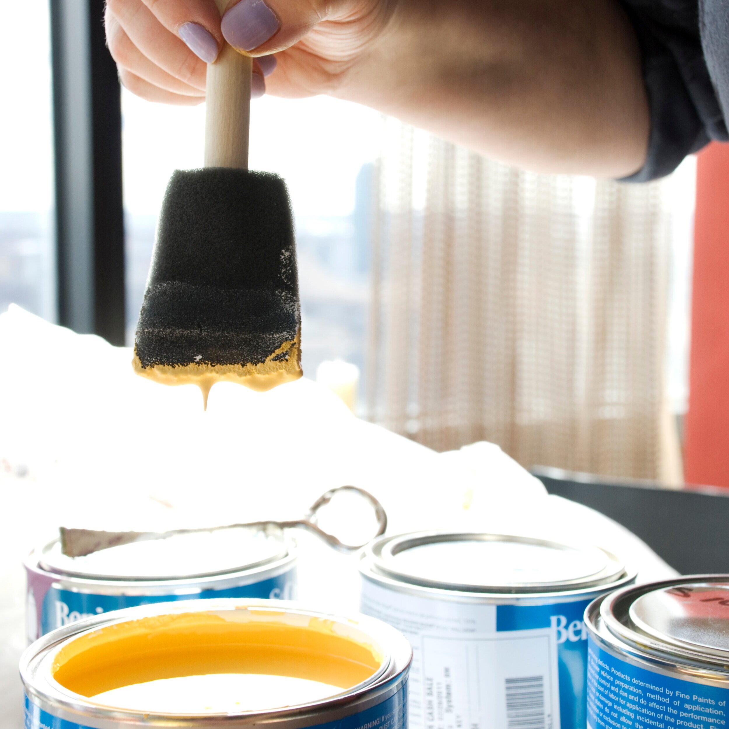
Developing a colour palette.
Premier Colour Collection
Paint Colours and Descriptions
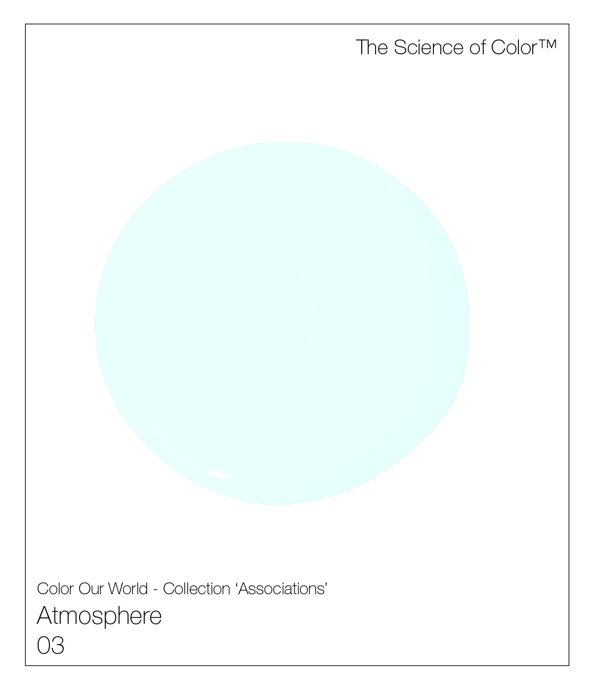
3. Atmosphere – The faintest of aquas.

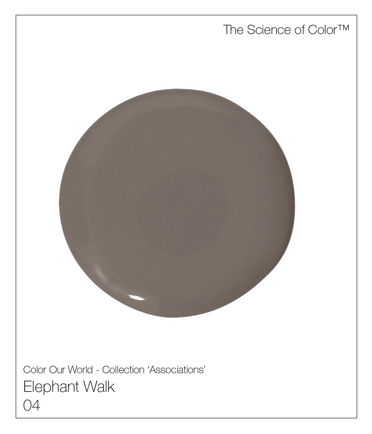
4. Elephant Walk – Named Elizabeth Taylor's movie by the same name. This shade of brown/taupe includes a considerable amount of red pigment, making it a warm ishade of Elephant.

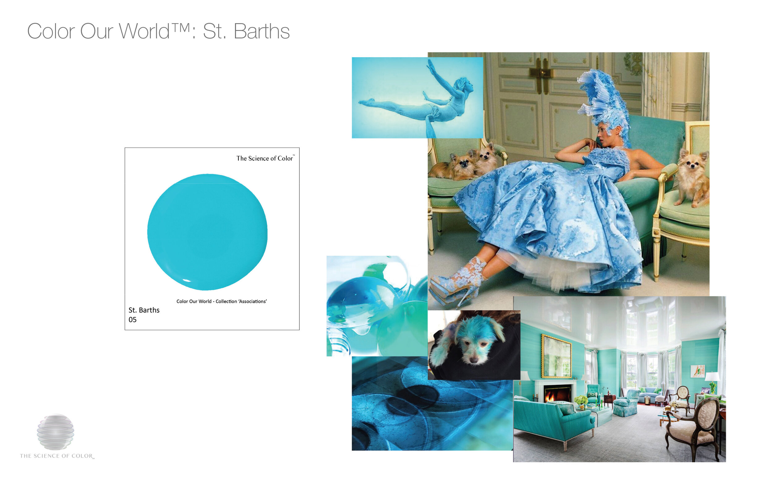
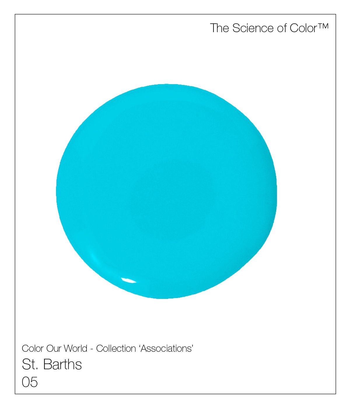
5. Saint Barths – See to Sky, where does one stop and the other begin?

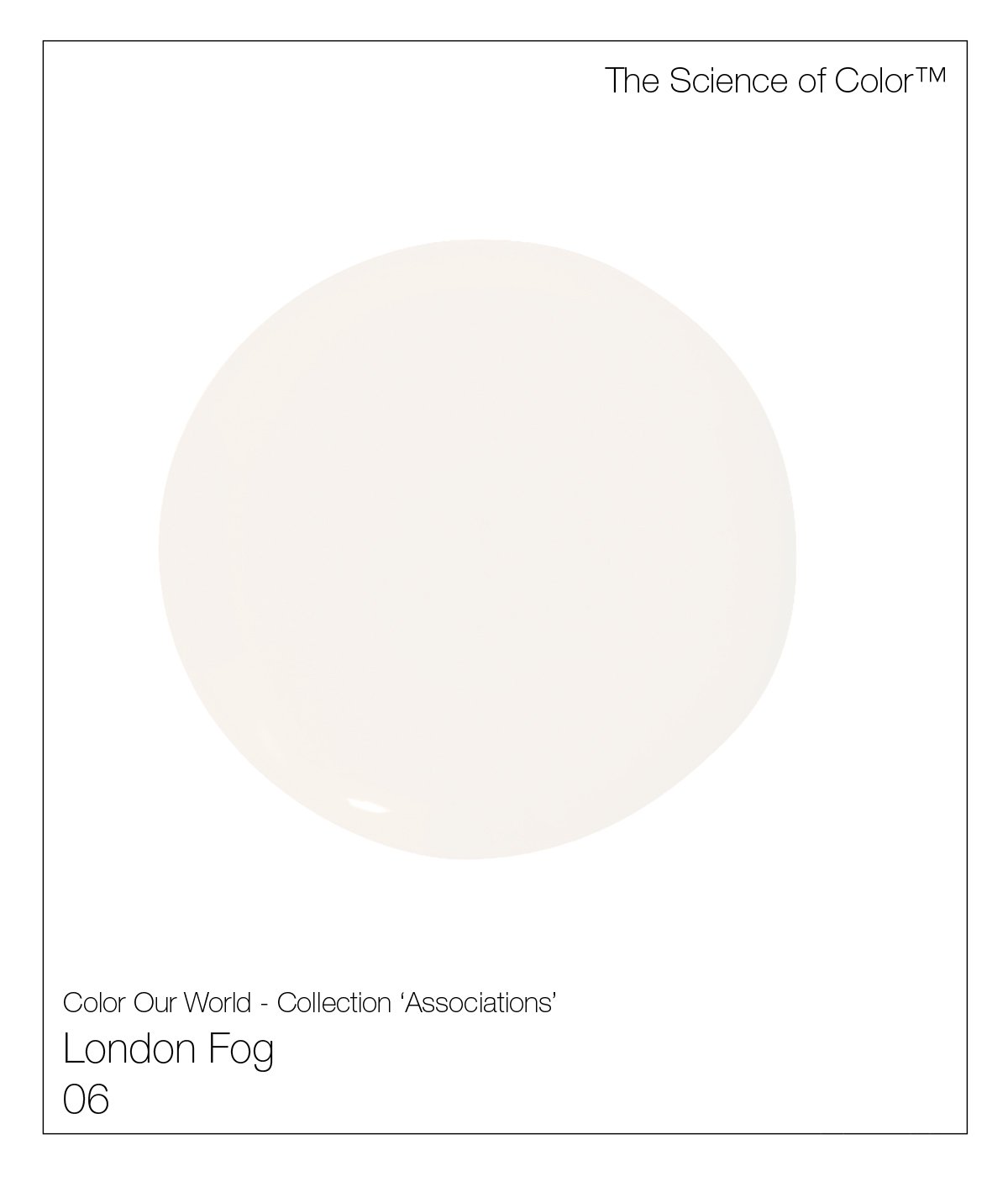
6. London Fog – a soft yet still warm shade of gray.
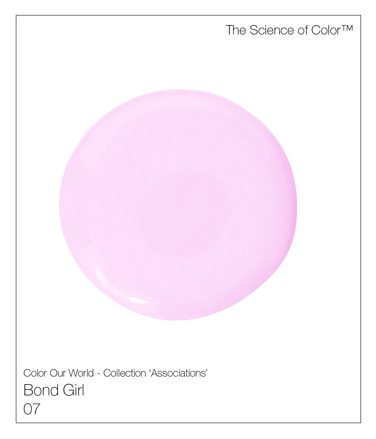
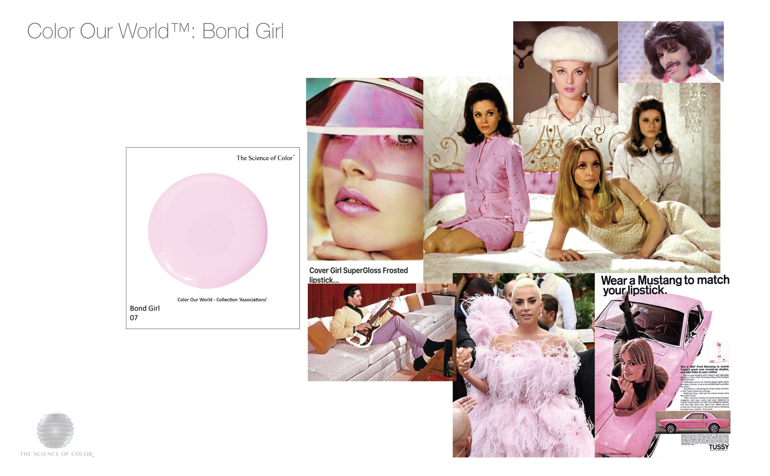
7. Bond Girl – Inspired a culmination of all the Bond Girls, icy pink lipsticks of the 1960’s.

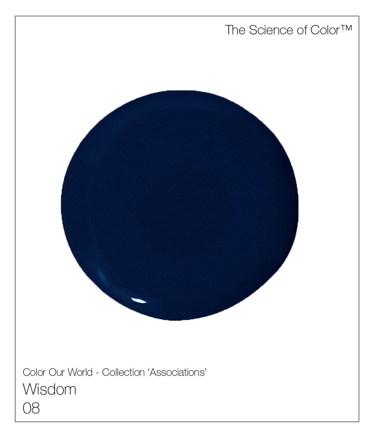
8. Wisdom – Images of Socrates contemplating the universe, was this deepest shade of midnight, which also includes a touch of deep red, ensuring no green cast.

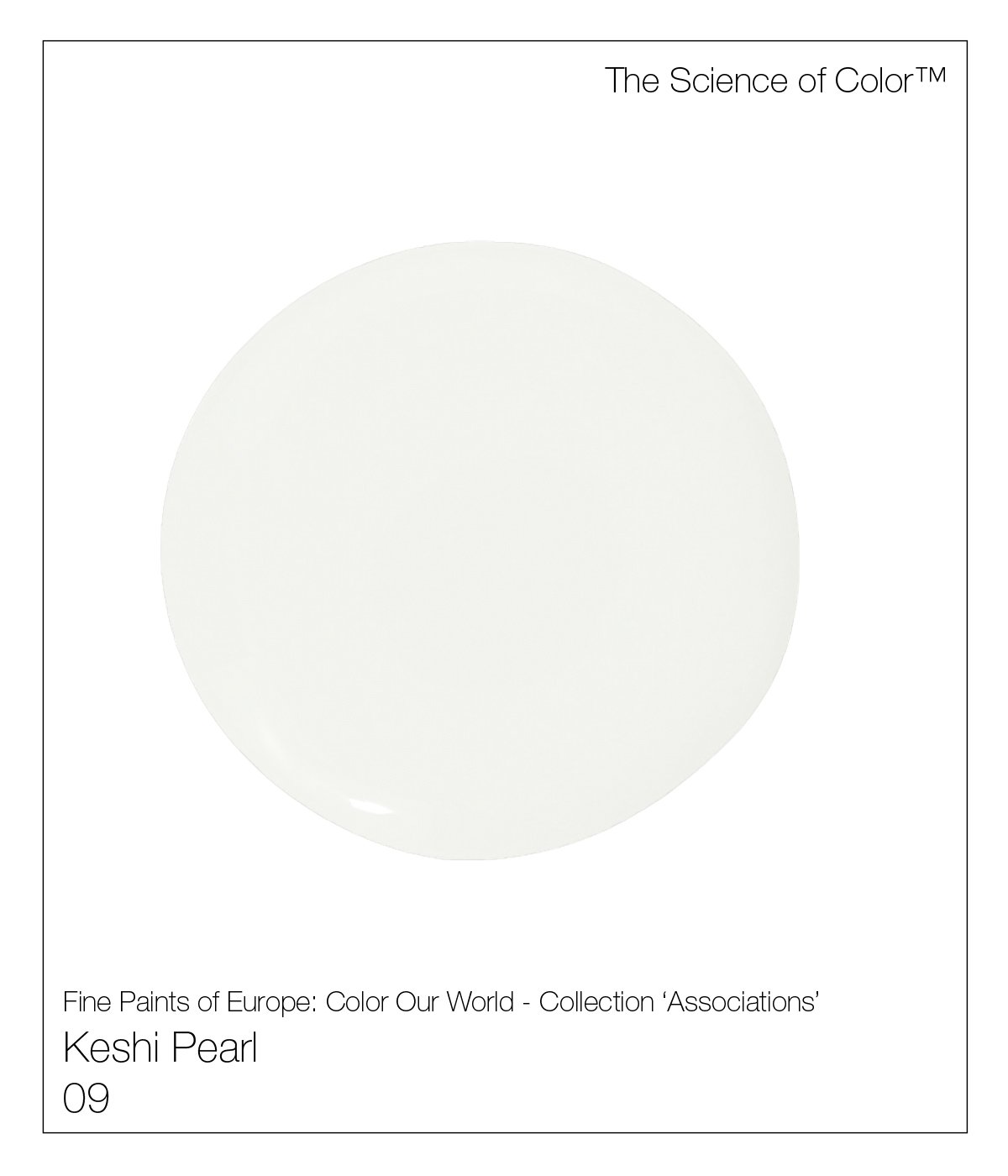
9. Keshi Pearl – Inspired this delicate shade of pearl.
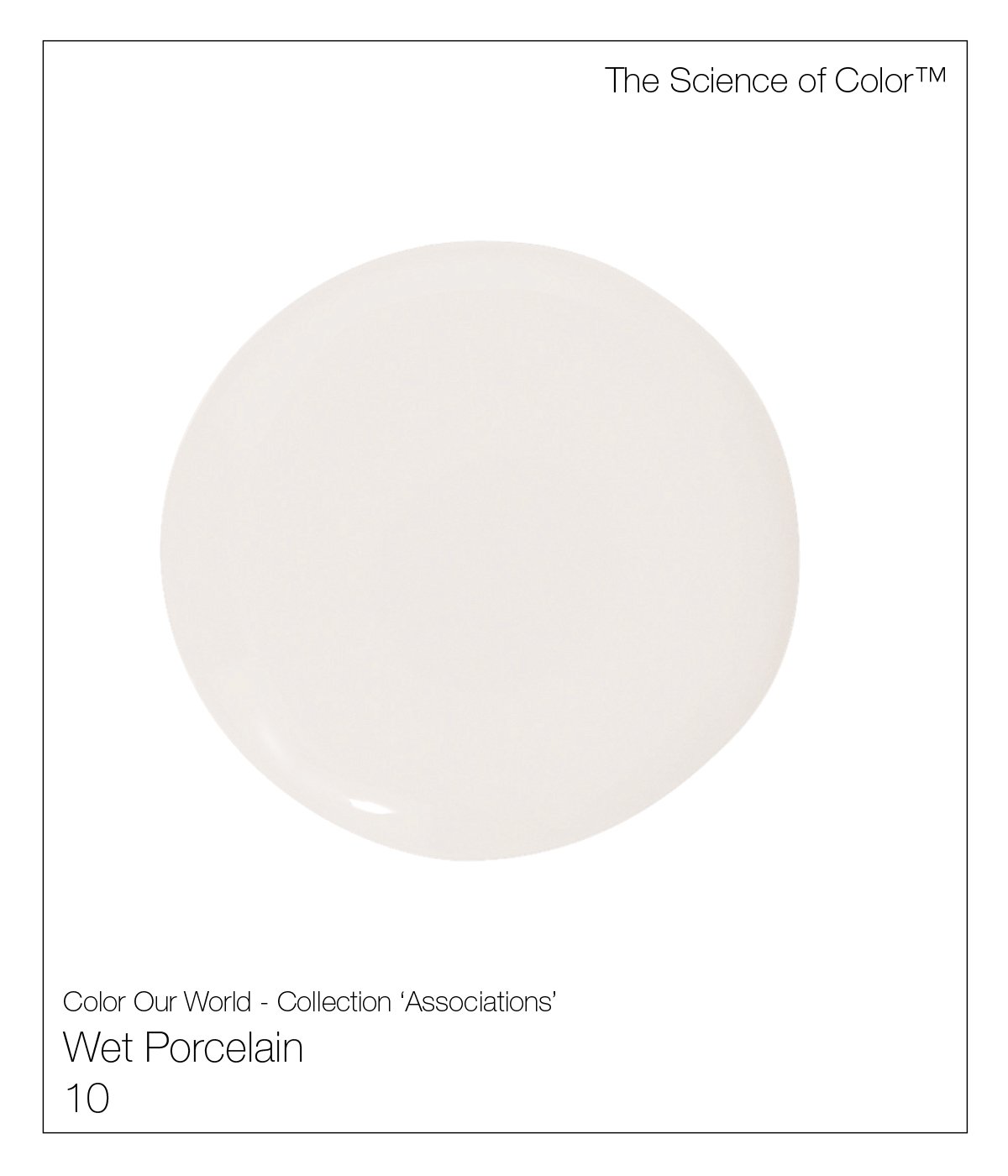
10. Wet Porcelain - Not bright white. Its ability to harmonize with most colours, softens any form of harsh contrast.
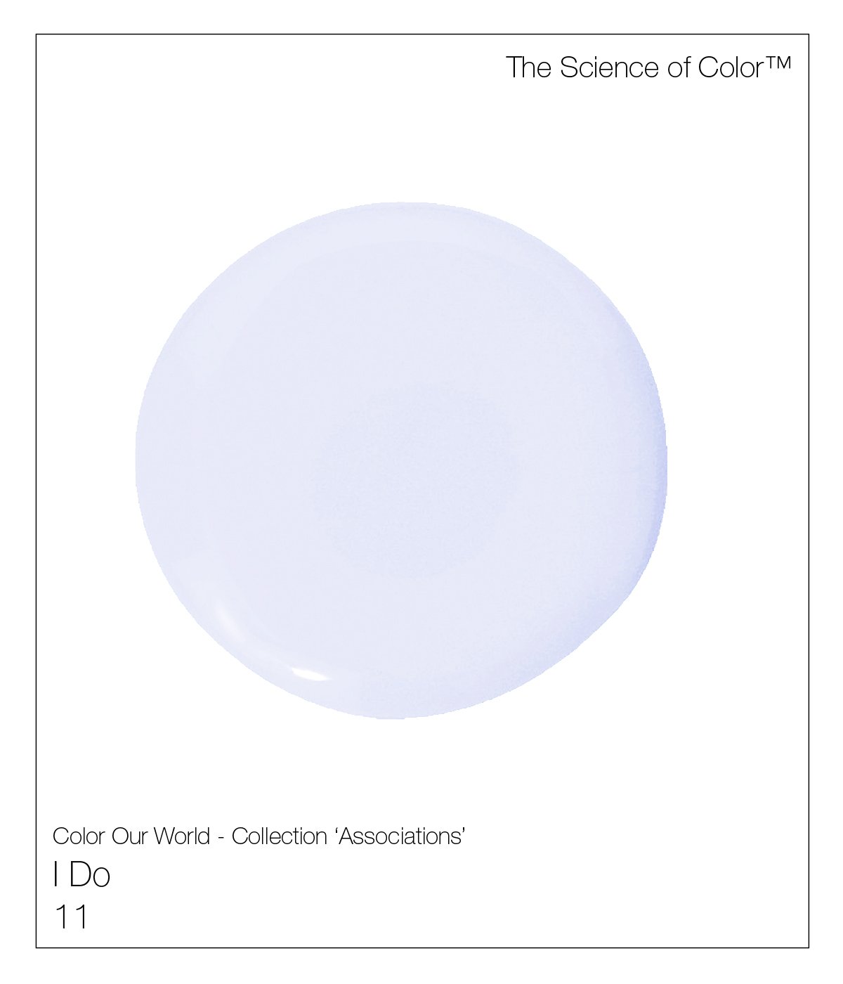
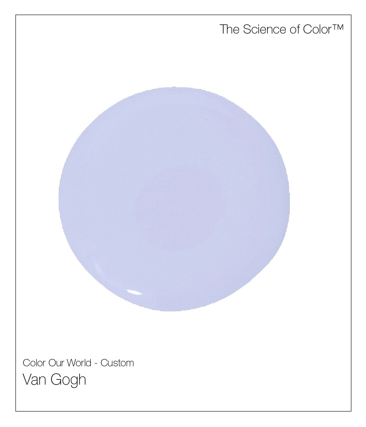
11. I Do – This delicate shade of Lavender evokes powerful visceral responses.
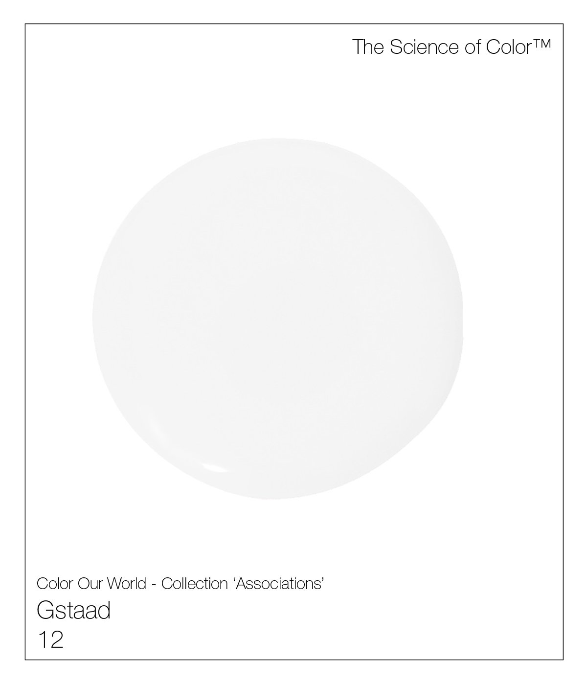
12. Gstaad – This cool white offers a complex formula.

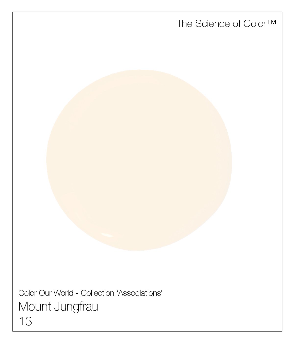
13. Mount Jungfrau – The warmth of this peachy white undertone, offers a flattering glow.
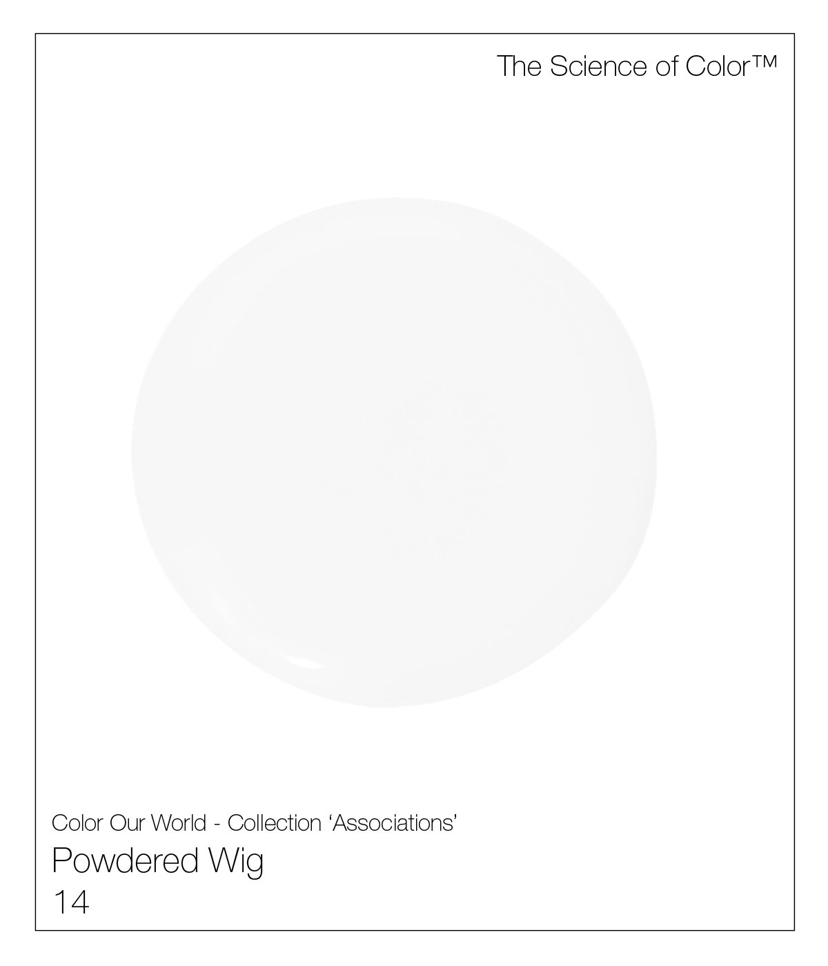
14. Powdered Wig – A truly cool mix of pigments.
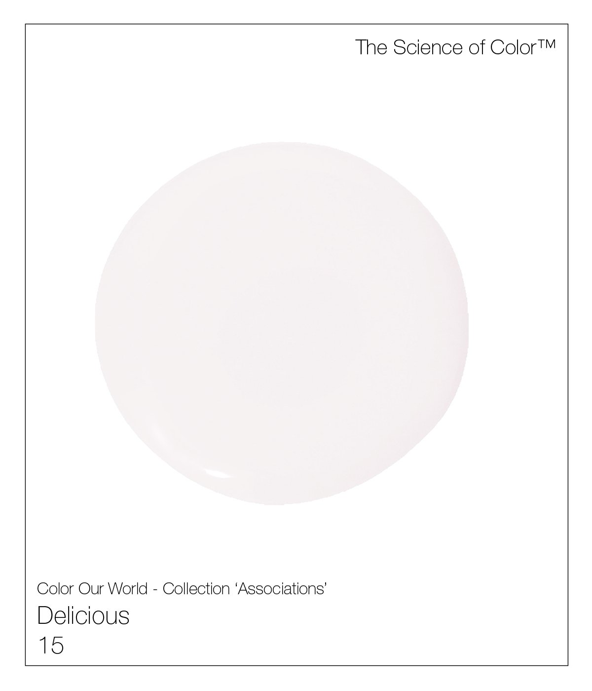
15. Delicious – Named after how it make you feel.

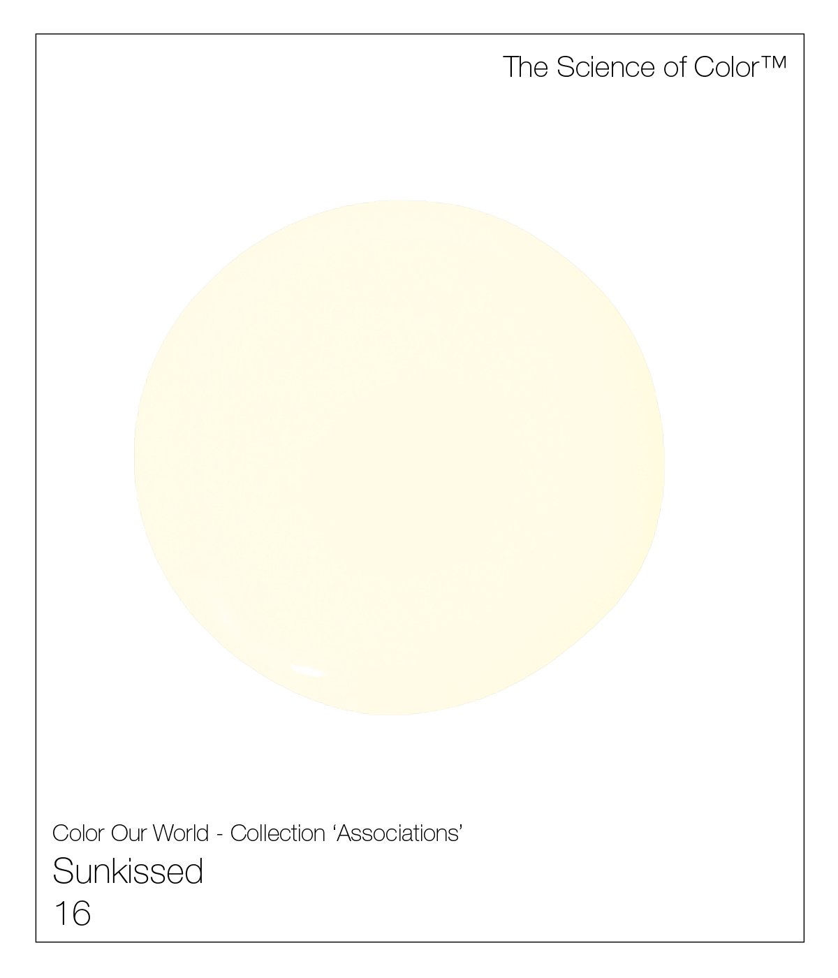
16. Sunkissed – This shade evokes warmth and the gentleness of a spring day.
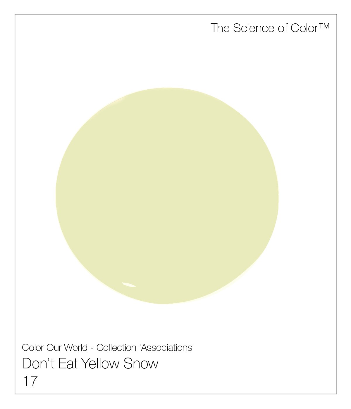
17. Don’t Eat Yellow Snow – This was and will forever be prudent advice.

18. Happiness –This colour offers a hint of peach, in this decidedly welcoming and understated shade.
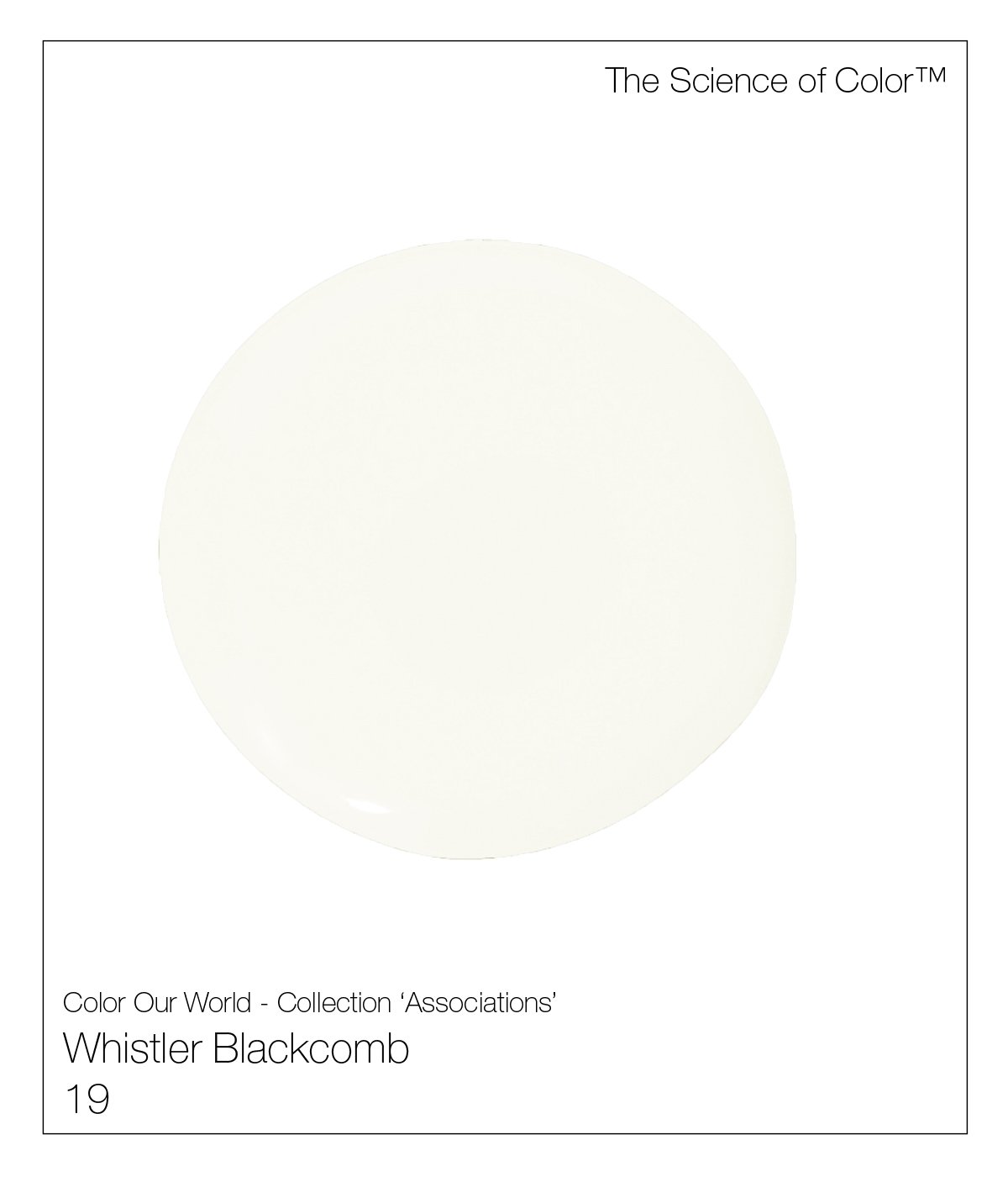
19. Whistler Blackcomb – A nod to my time on the coast of British Columbia. This is the whitest equal parts warm and cool.

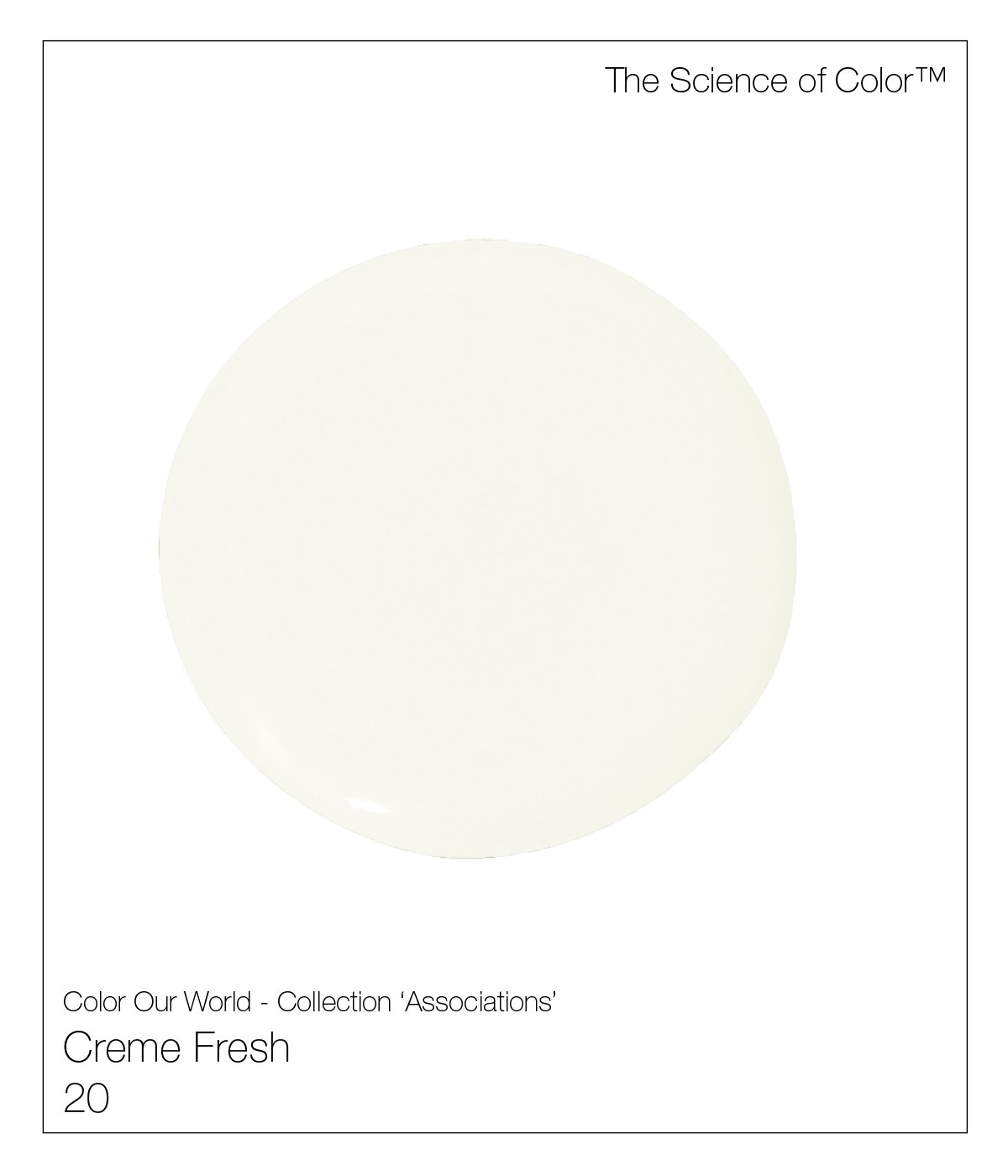
20. Crème Fresh – The colours of French dairy offer a mélange of whites, ivories, and pinks. This one definitely errs on the pink side.

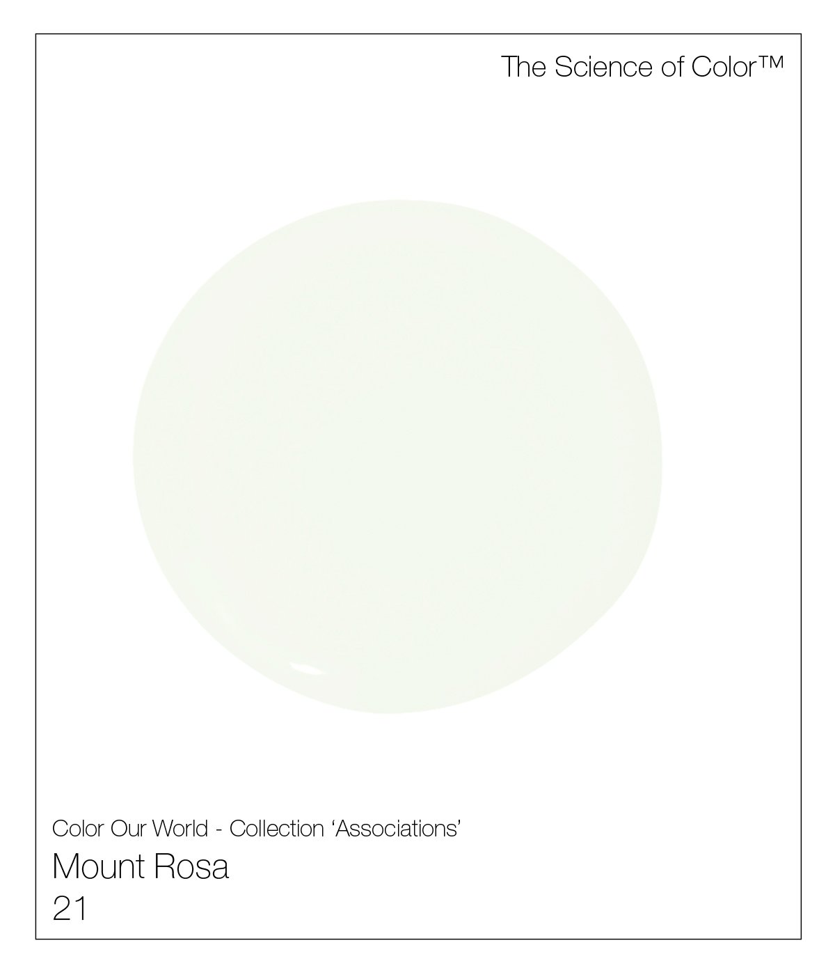
21. Mount Rosa – This complex shade of white, offers a warmer, and tan shade of neutral.

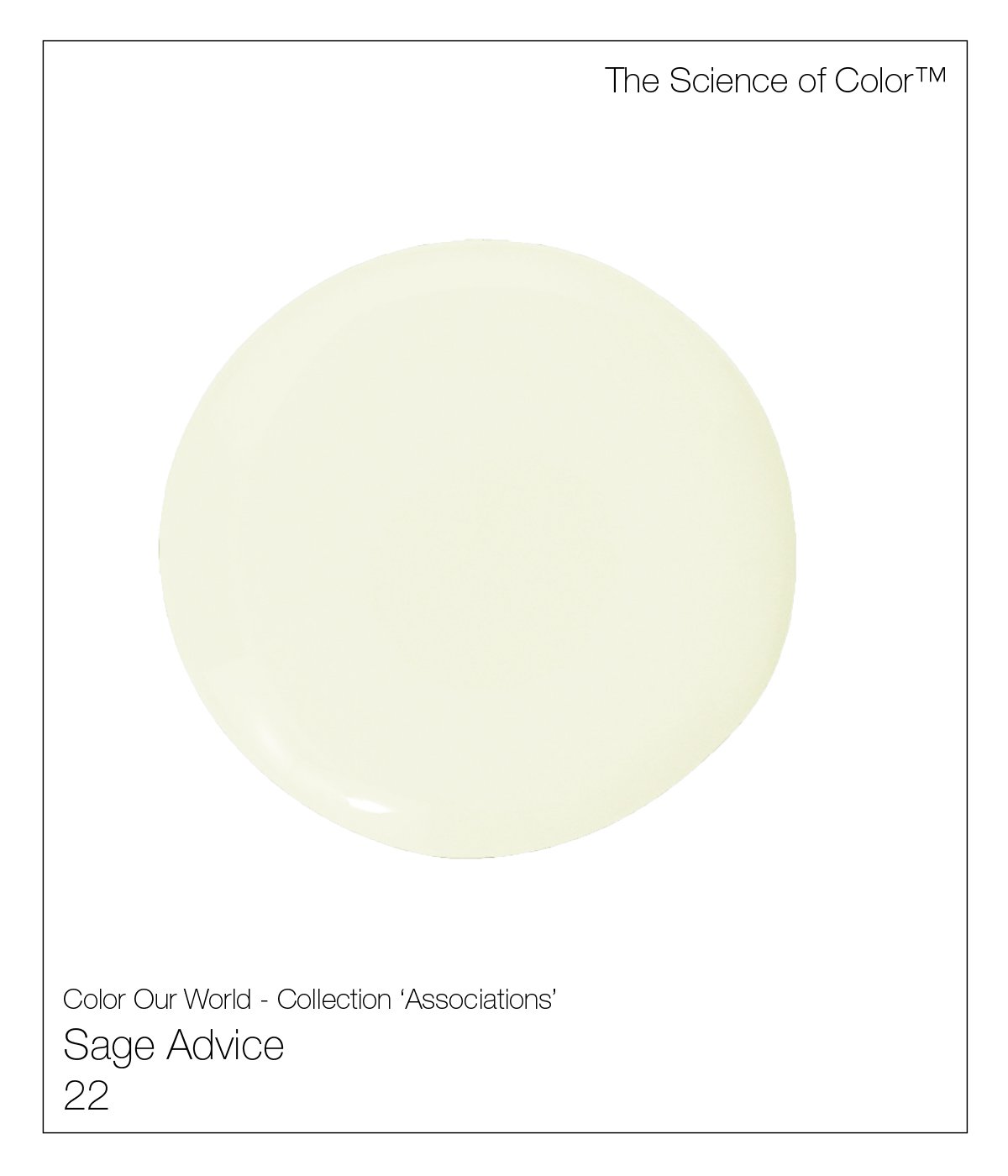
22. Sage Advise – This is our nod to the nuances of sage and cooler tones of celadon.

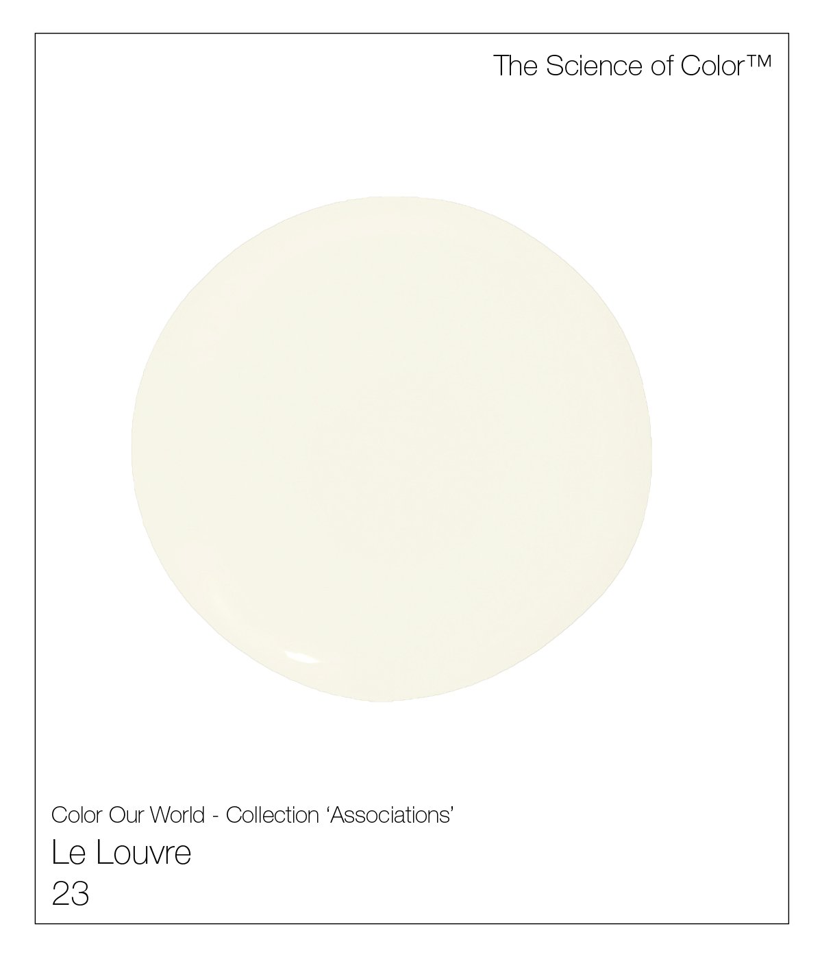
23. Le Louvre – This shade claims its origins from the limestone blocks of The Louvre.

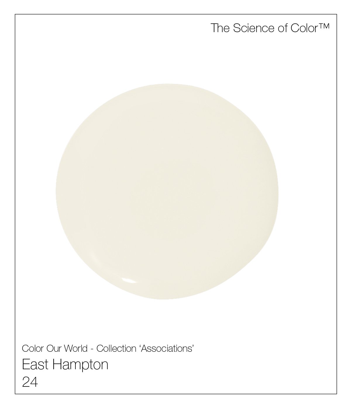
24. East Hampton – Created from my earliest memories of light, and clapboard. A warm understated shade of weathered cedar.

26. Vellum – Art Deco celebrated this glorious material as walls, furniture, and libraries filled with its covered collections.

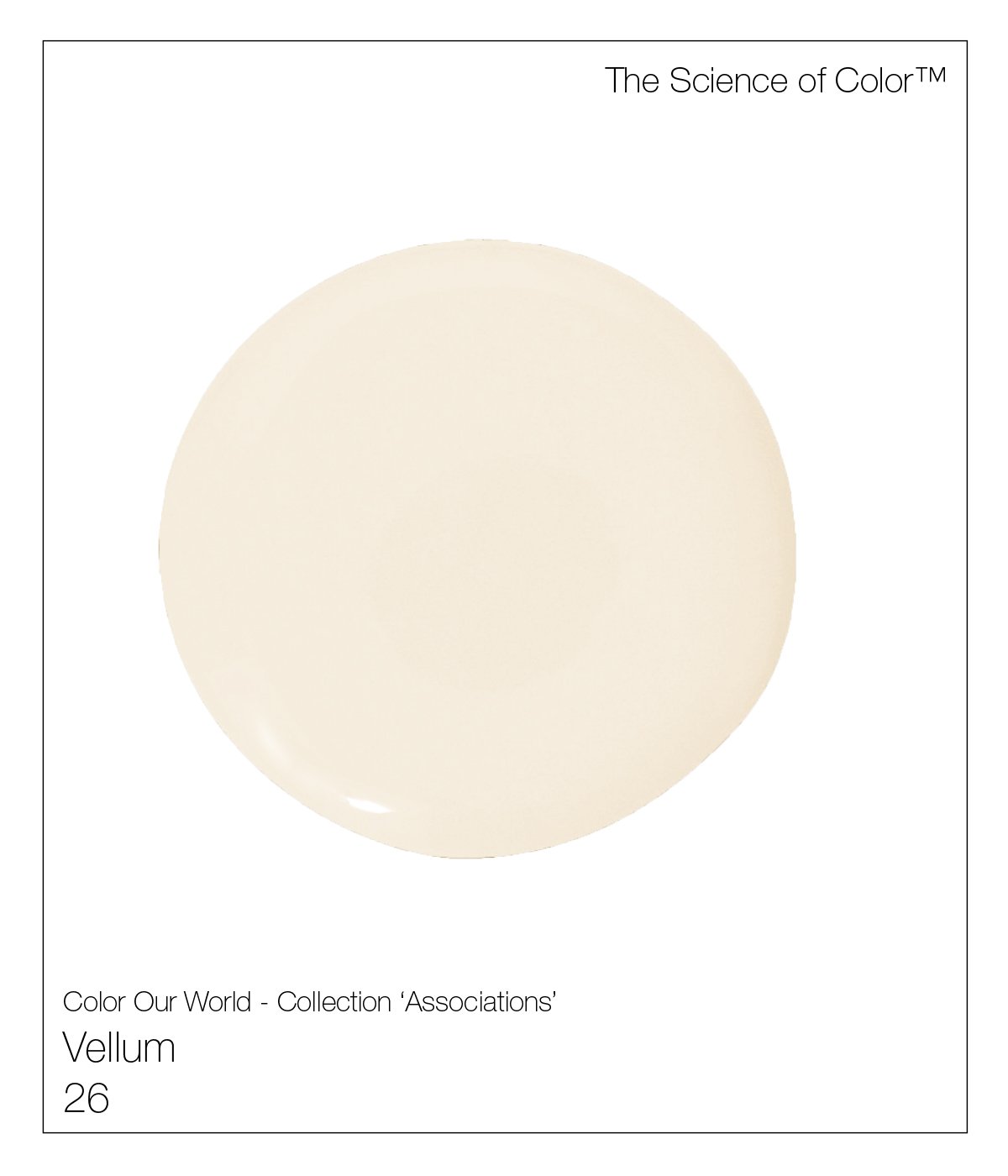
26. Vellum – A nod to a time when it wasn’t used to simply sketch upon. Art Deco celebrated this glorious material as walls, furniture, and libraries filled with its covered collections. This shade offers its warmth from both pink and yellow influences.

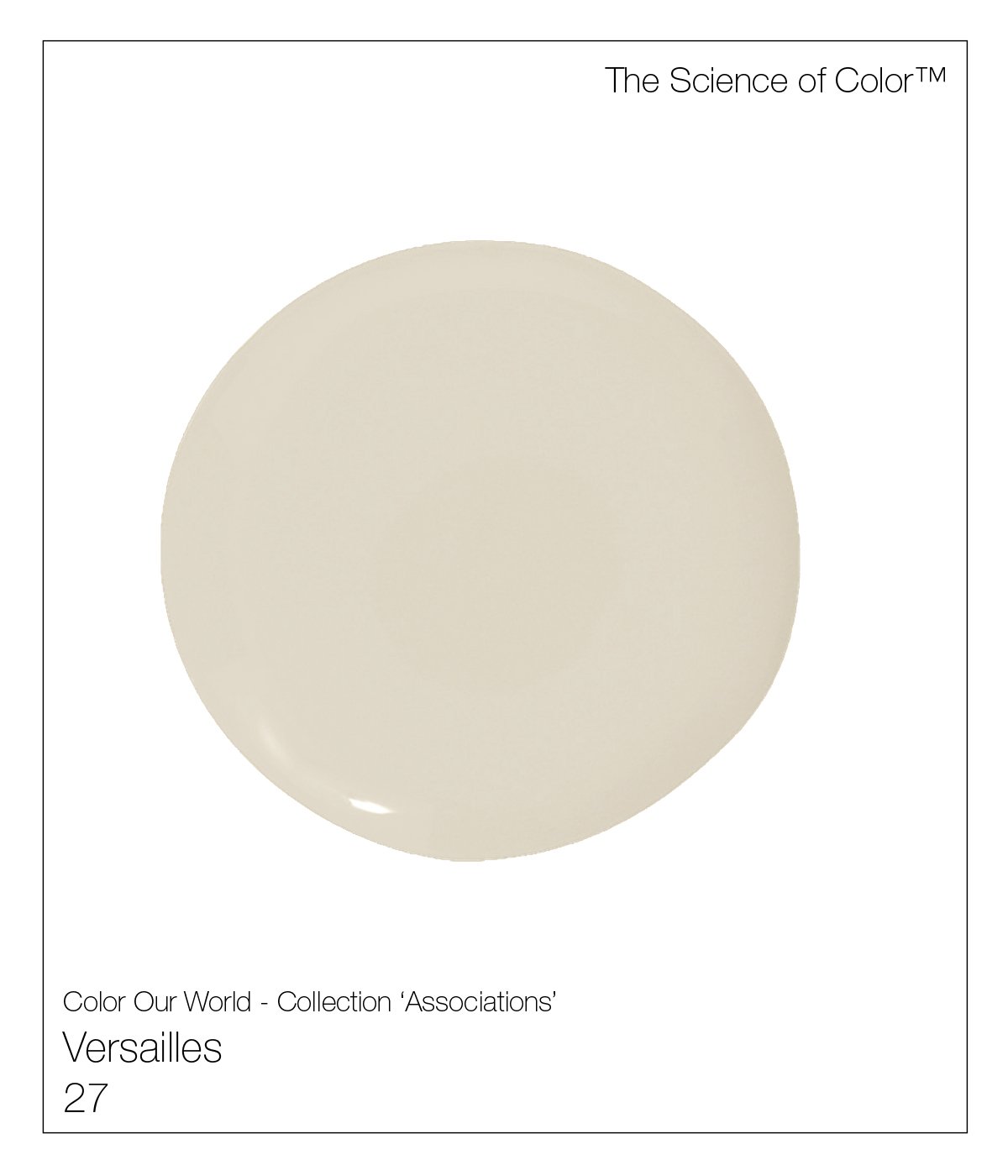
27. Versailles – Before there was the Louvre Museum, there was Versailles. Age and history created the patina of Versailles limestone's, warmer and deeper caramel tones.
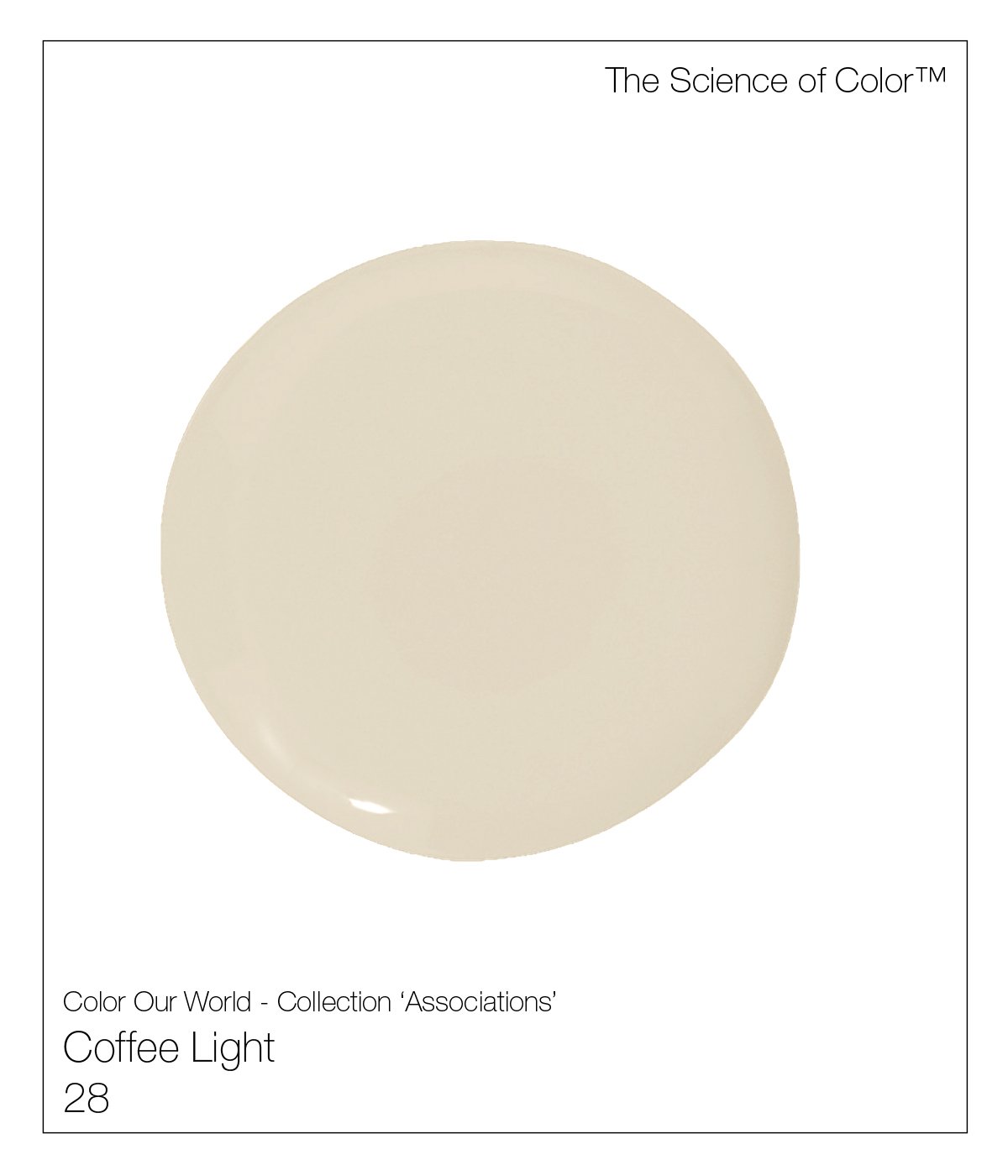
28. Coffee Light – This shade offers both warmth and light – no sugar.

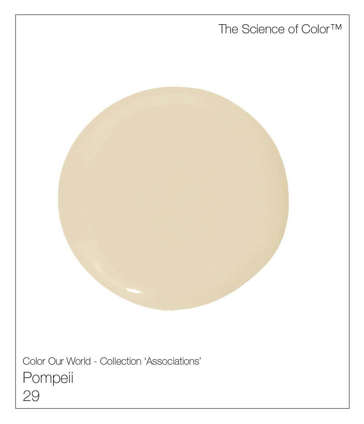
29. Pompei – The redness of Pompeian clay, permeates everything, here. The colors of milk and honey that filter all the towns remains.
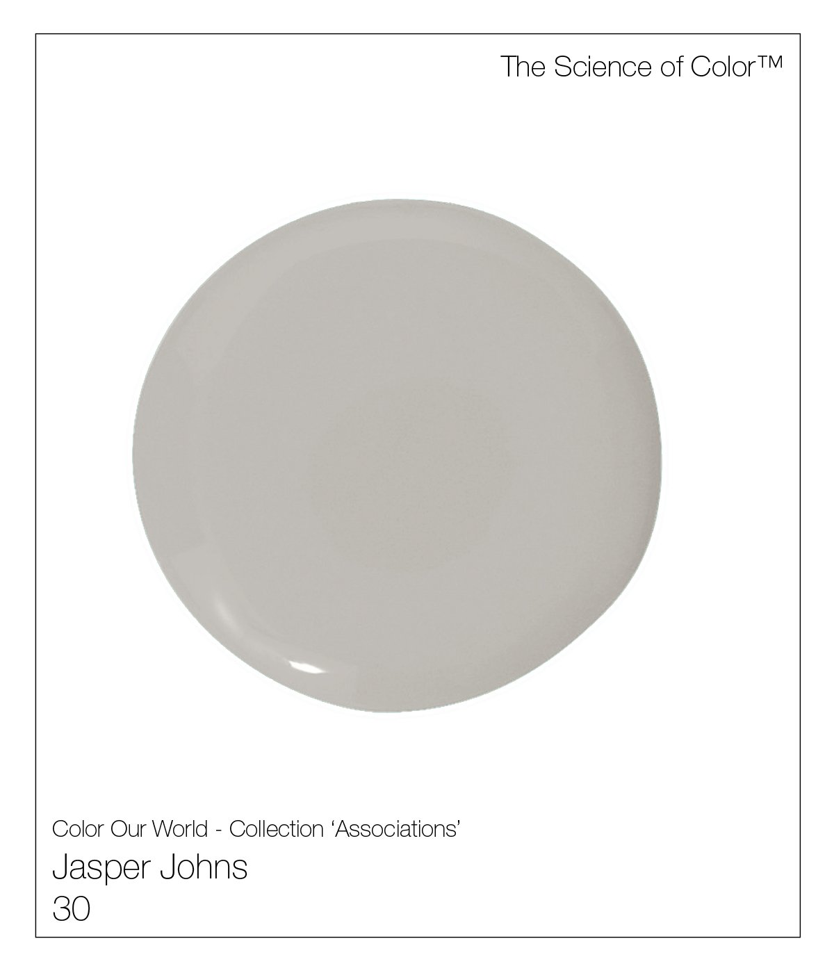
30. Jasper Johns – Jasper Johns, was our muse with the creation of this shade. It’s a complex mix of taupe, gray and lavender.

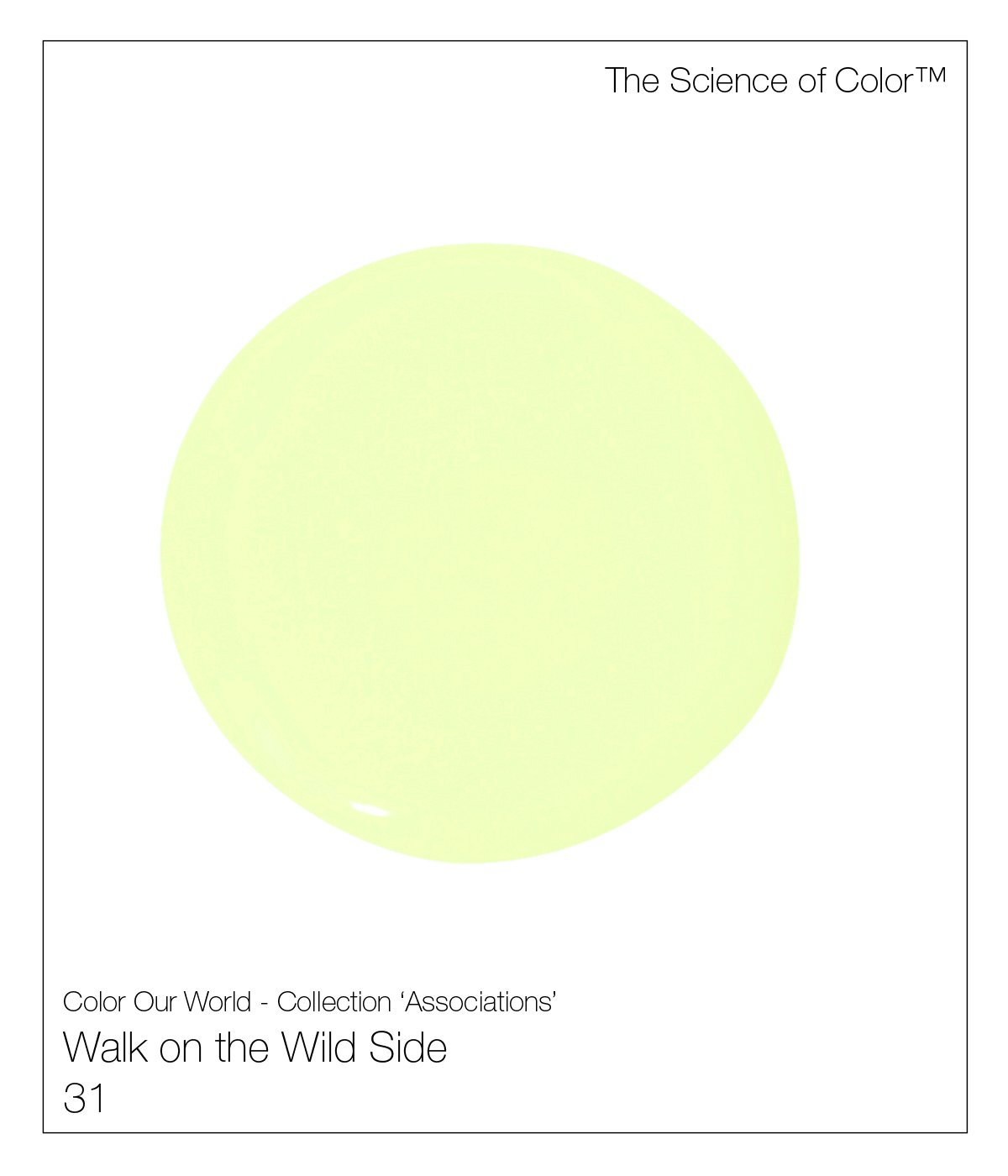
31. Walk on the Wild Side – This colour conjures up Lou Reed, and his shy band manager, Andy Warhol. This shade of truly acid green would have permeated it all. This colour is not for the timid.

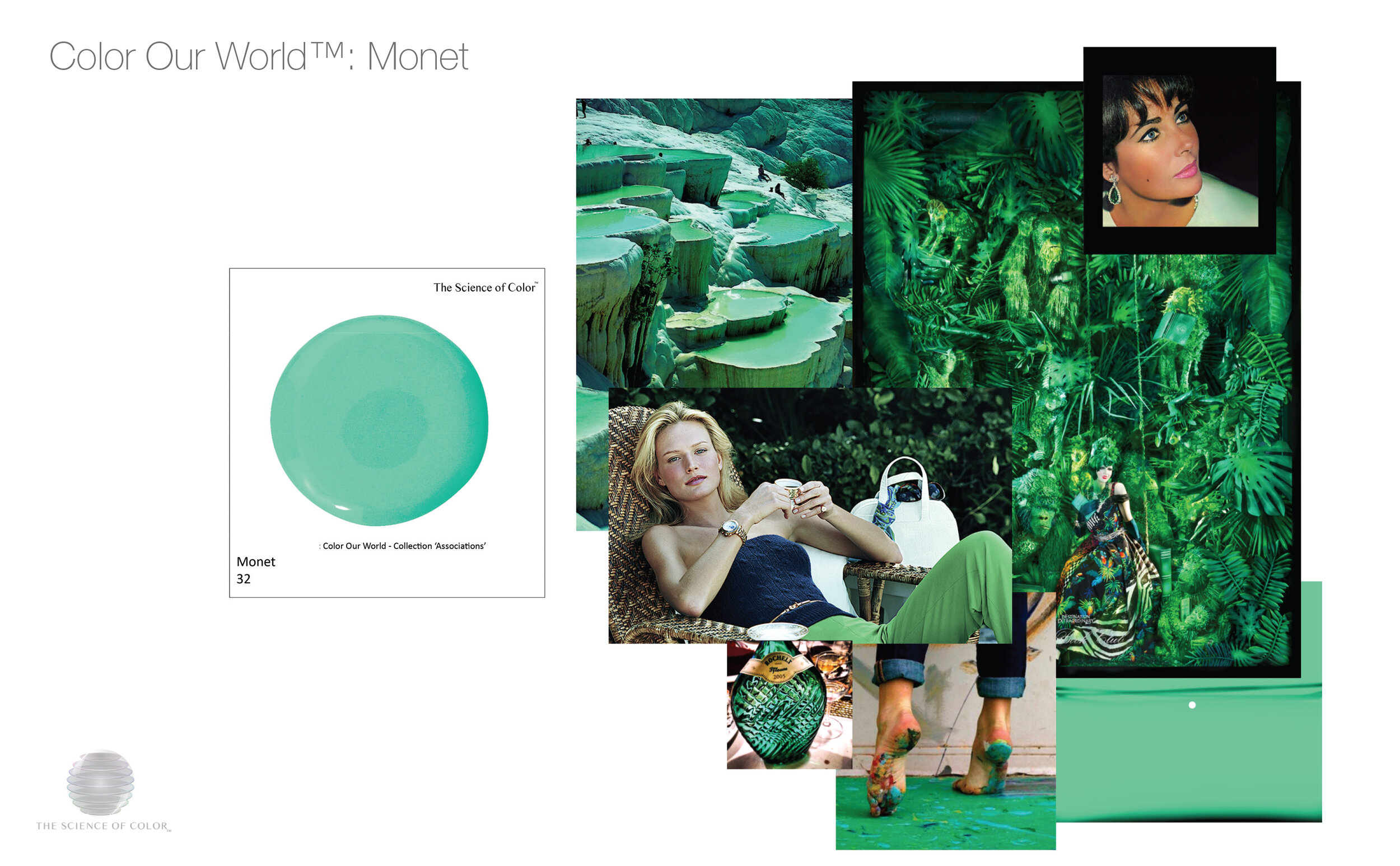
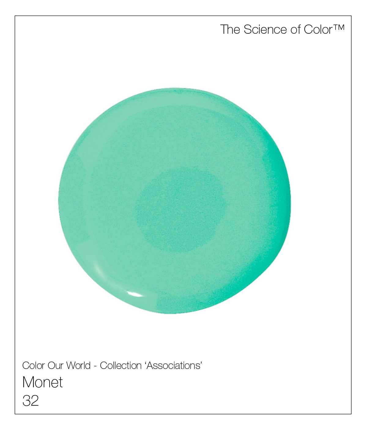
32. Monet – This most unusual shade of green was alive and well art Giverny. This shade is cooler than most. It features the absence of much yellow with a strong presence of white. in its mix.

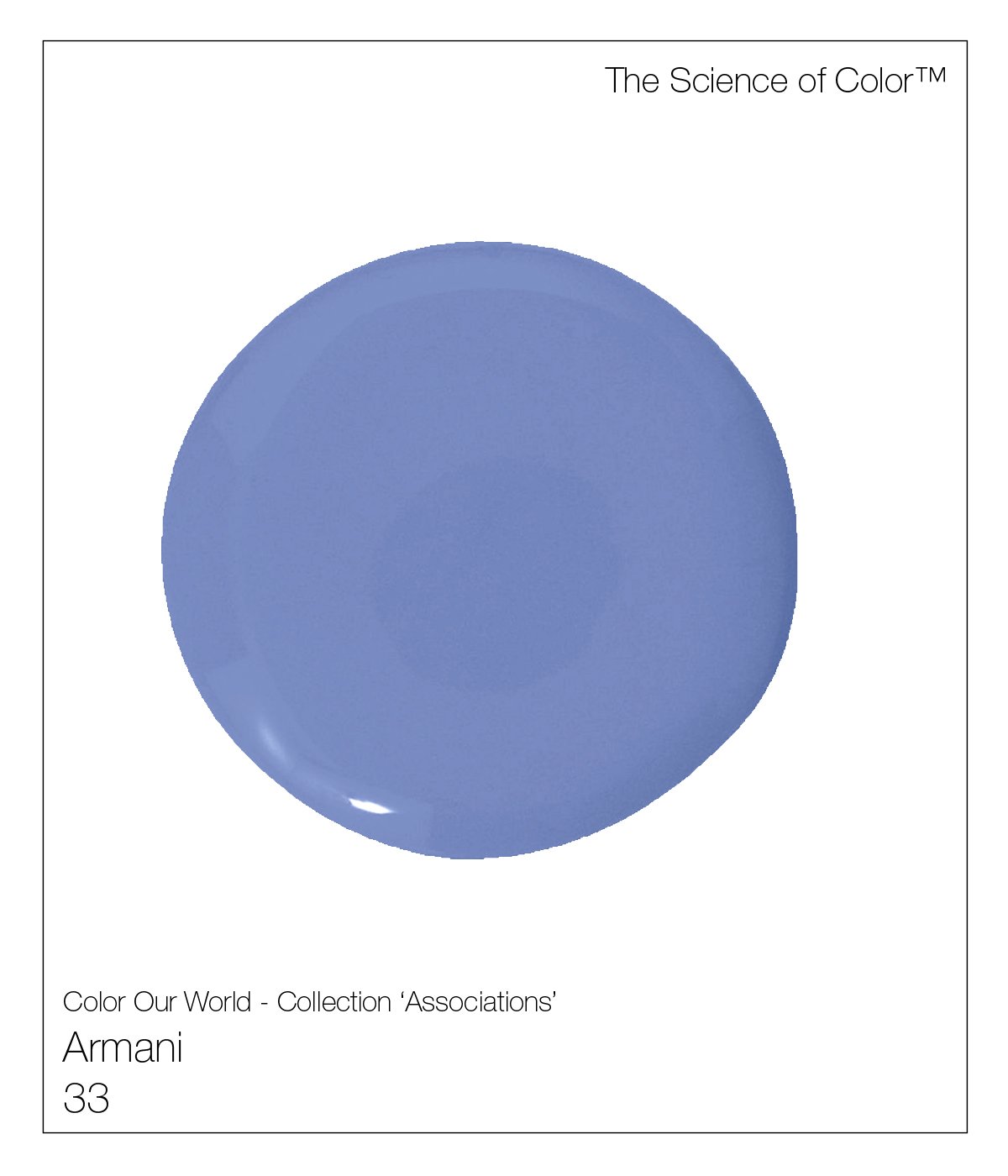
33. Armani – The master of couture and nuanced colours. Armani’s shades of the 80s proved as inspiration for this deeply pigmented shade of all but dusk.
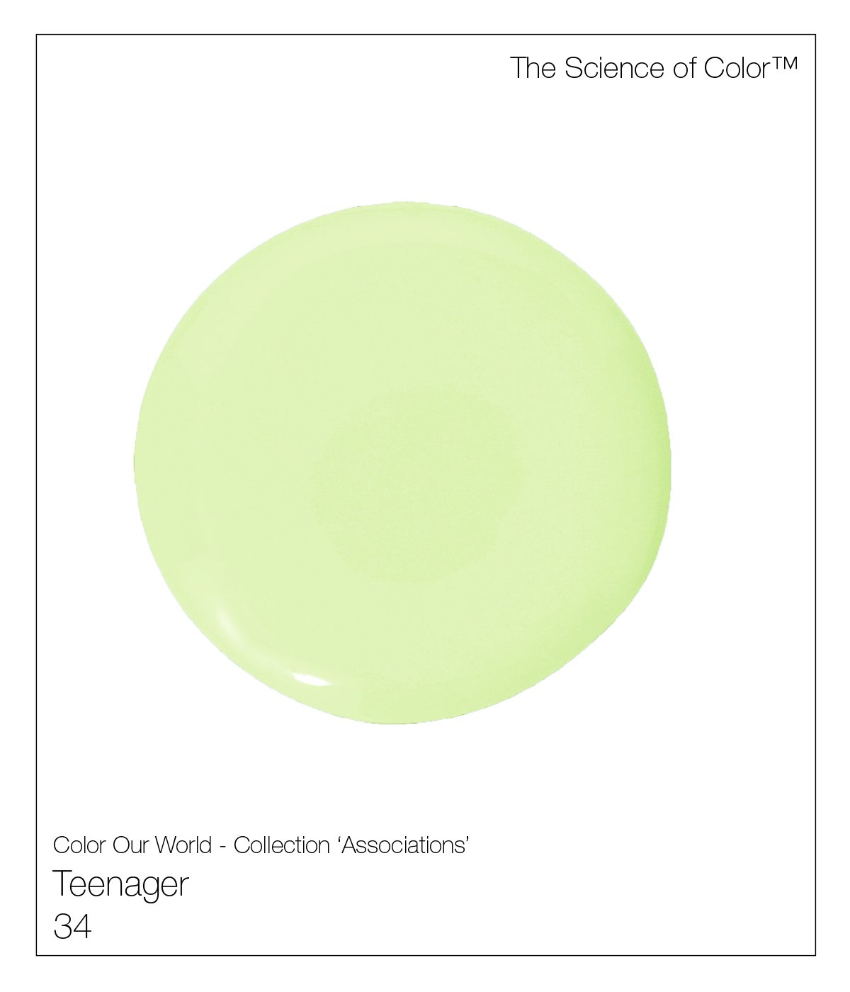
34. Teenager – This colour was named due to its freshness. This is a true fresh springtime green.

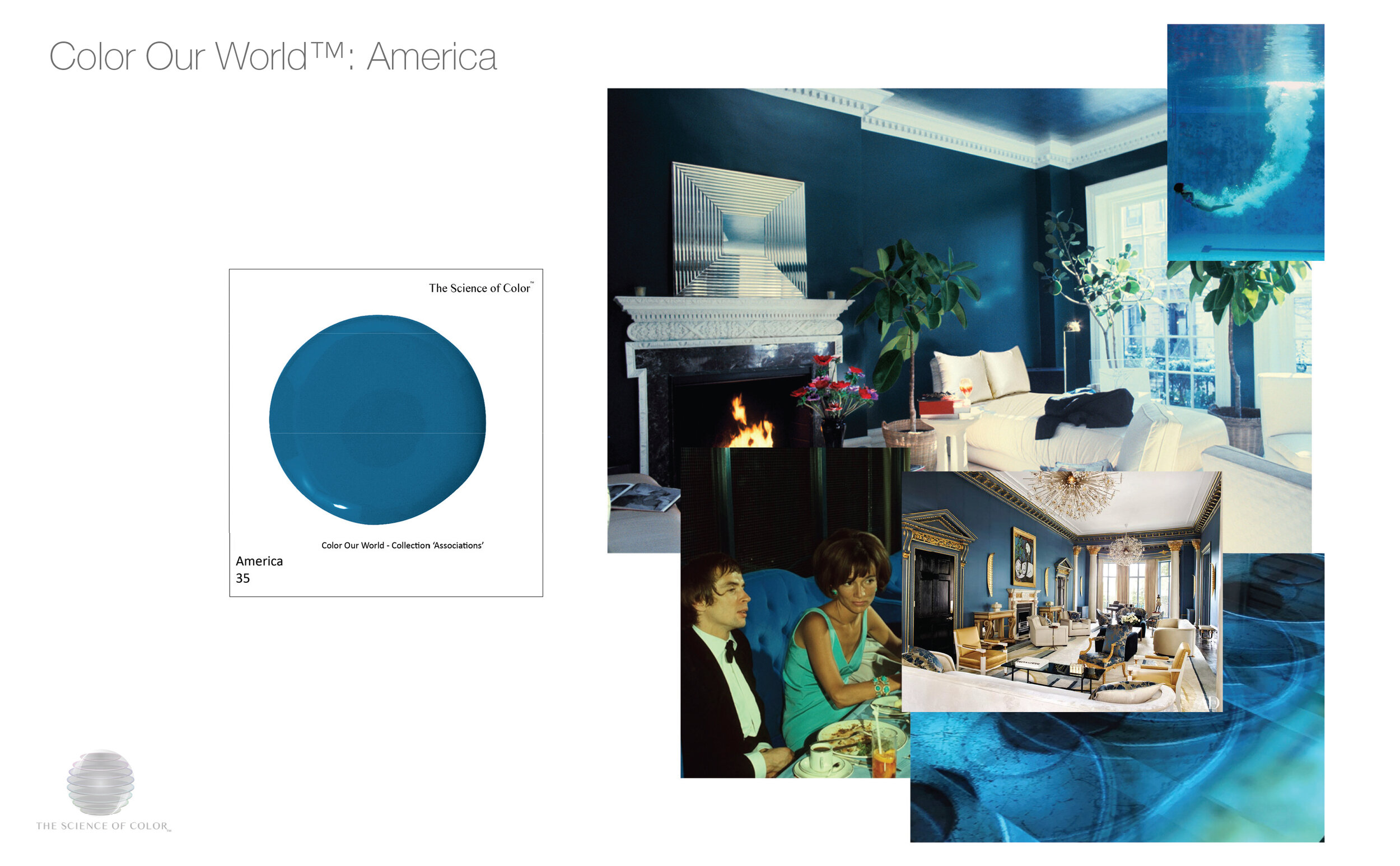
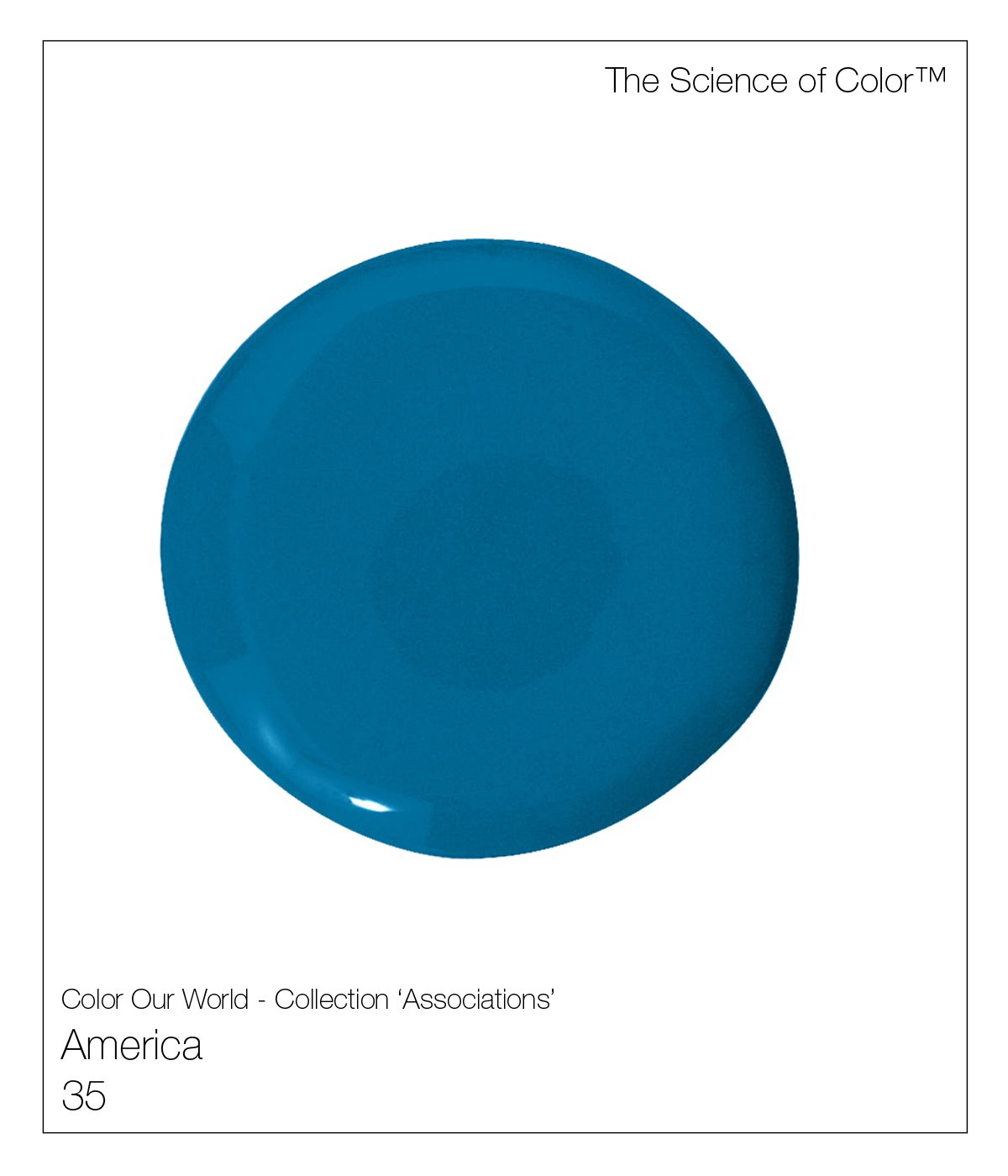
35. America – This is a true American Federalist colour. Nothing more or less. It lives up to its name and is highly pigmented.
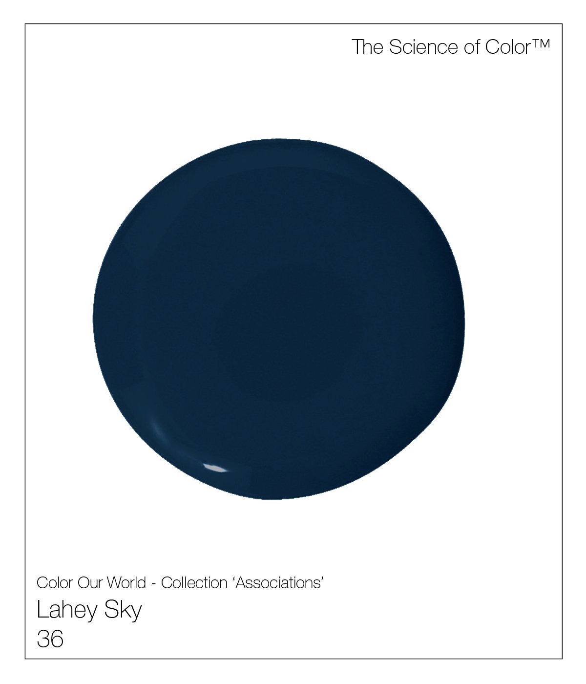
36. Lahey Sky – Named in honor of the founder of Fine Paints of Europe. John Lahey Jr.’s favorite colour. This shade is the deepest of sea blues, black and green.

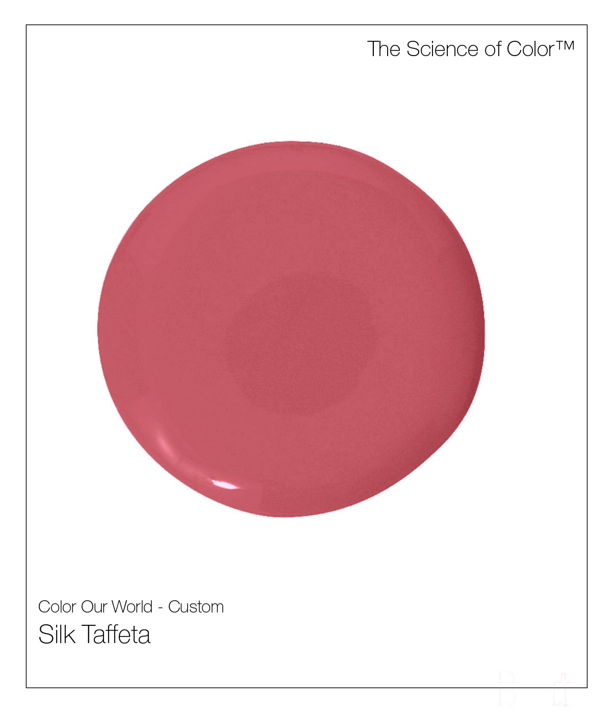
37. Hot Salmon – This is the shade of Cohoe Salmon. This shade is an equal mix of hot pink and hot orange.

38. Firenze – Images of the terracotta tile roofs of Florence. This is a deep shade of cool yellow-orange.
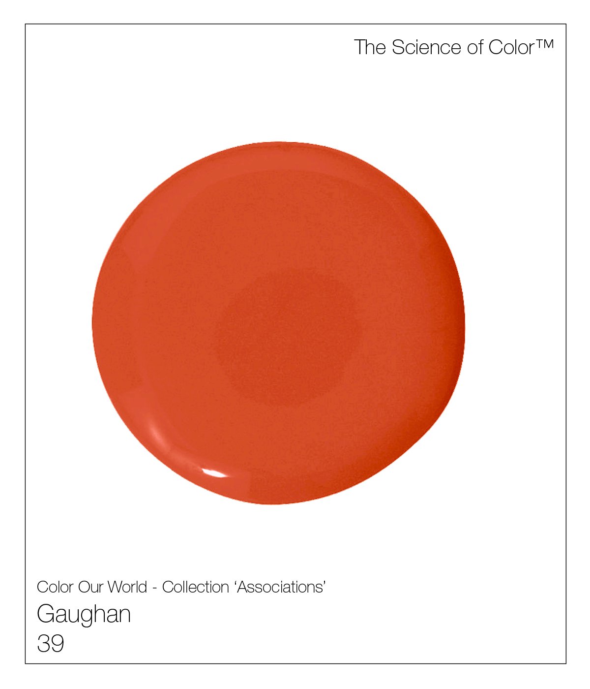
39. Gauguin – Gauguin's, French Polynesian collection embraced these deepest or red oranges’.
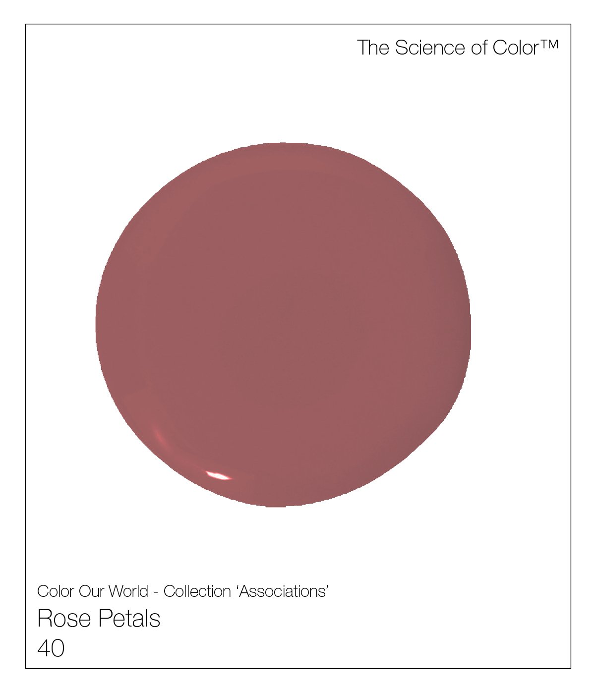
40. Rose Petals – Sweet memories, faded and air dried, cause this romantic shade.
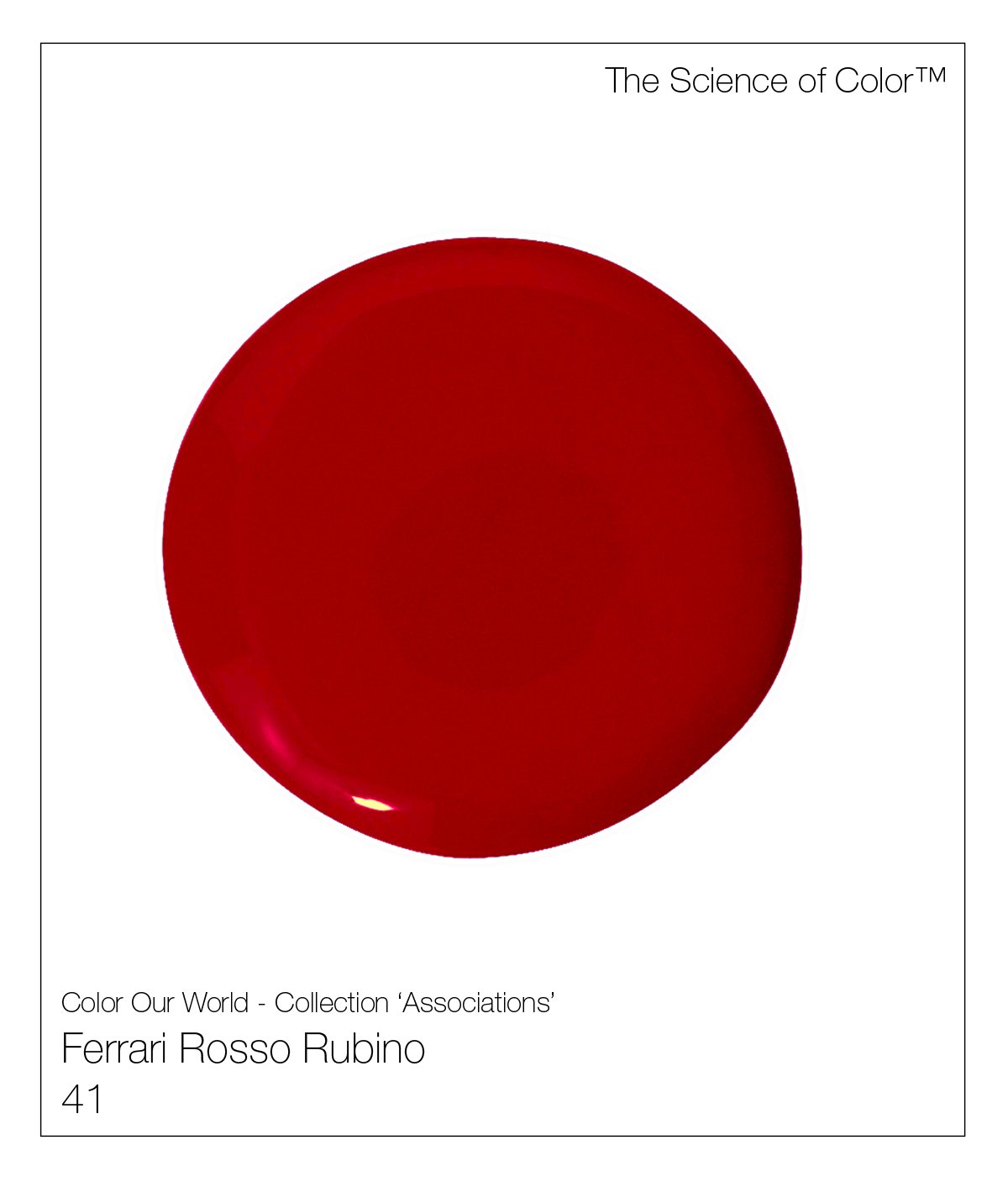
41. Ferrari Rossa – If you are looking for a highly pigmented red that will stop you in your tracks – You’ve found it. FRR has a slight burgundy wine colour with a hint of blue, no yellow is in this red.

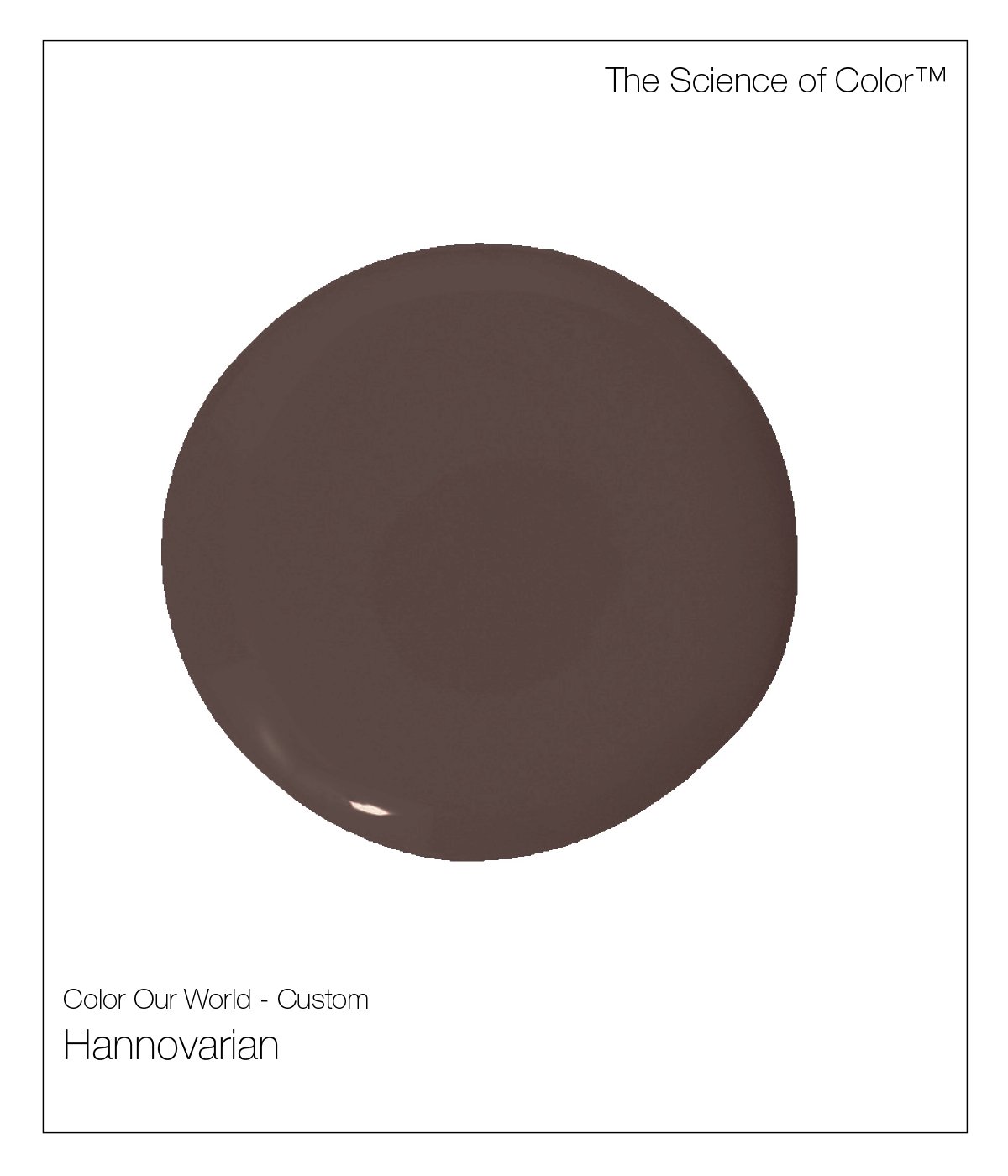
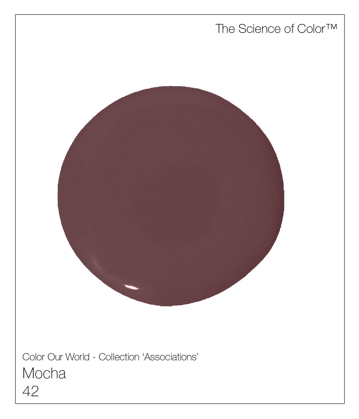
42. Mocha – This complex colour feature shades of brown with hints of lavender.
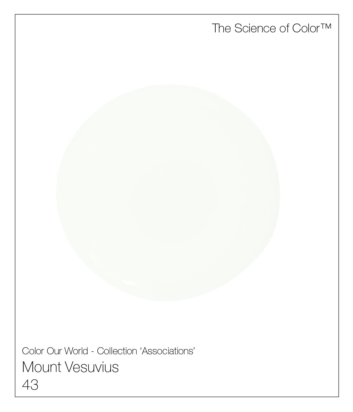
43. Mount Vesuvius – It takes its soft peach | warm influence from the ash that surrounds it.

44. Mount Blanc – This is the coolest of our whites.

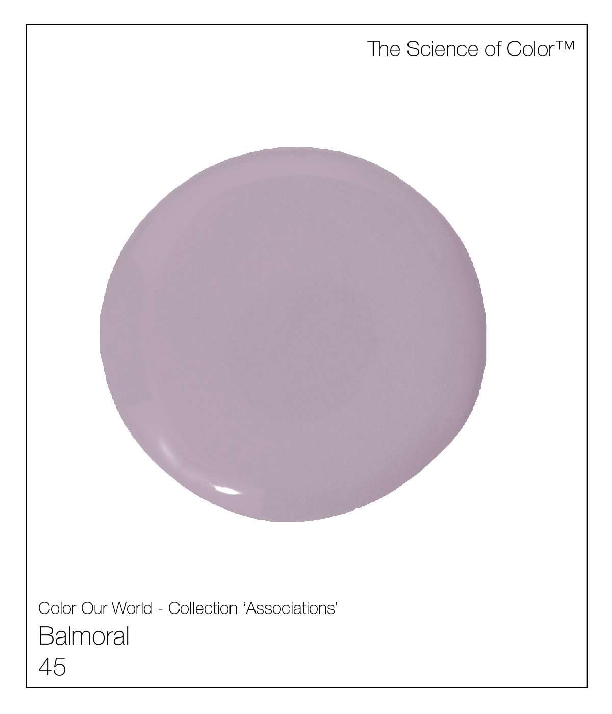
45. Balmoral – Reflecting QE2's, summer residence nestled within the heathered highlands.
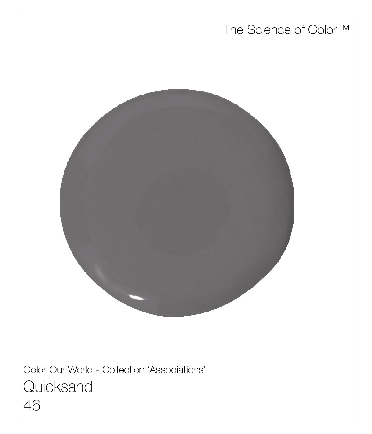
46. Quicksand – Inspired by its namesake, there are pink hues within this complex mix.
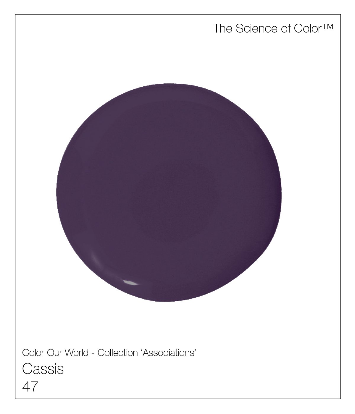
47. Cassis – Kir Royal, anyone? Inspired this deeply pigmented currant shade.

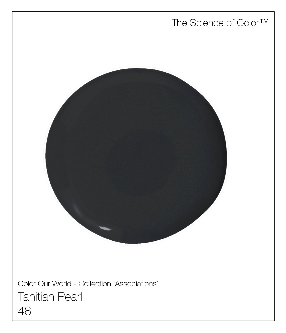
48. Tahitian Peal – This shade is the kissing cousin to black, yet not nearly as severe. Red pigments permeate this shade.

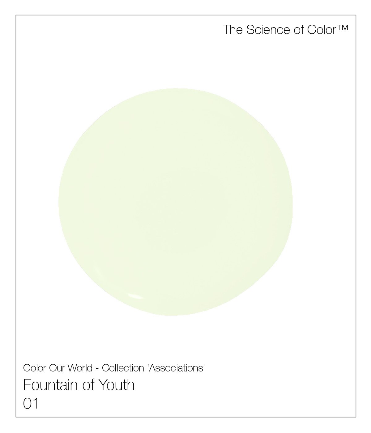
1. Fountain of Youth – The colour, like many of this collection, was created for one of our clients. It was our client’s desire for eternal youth.

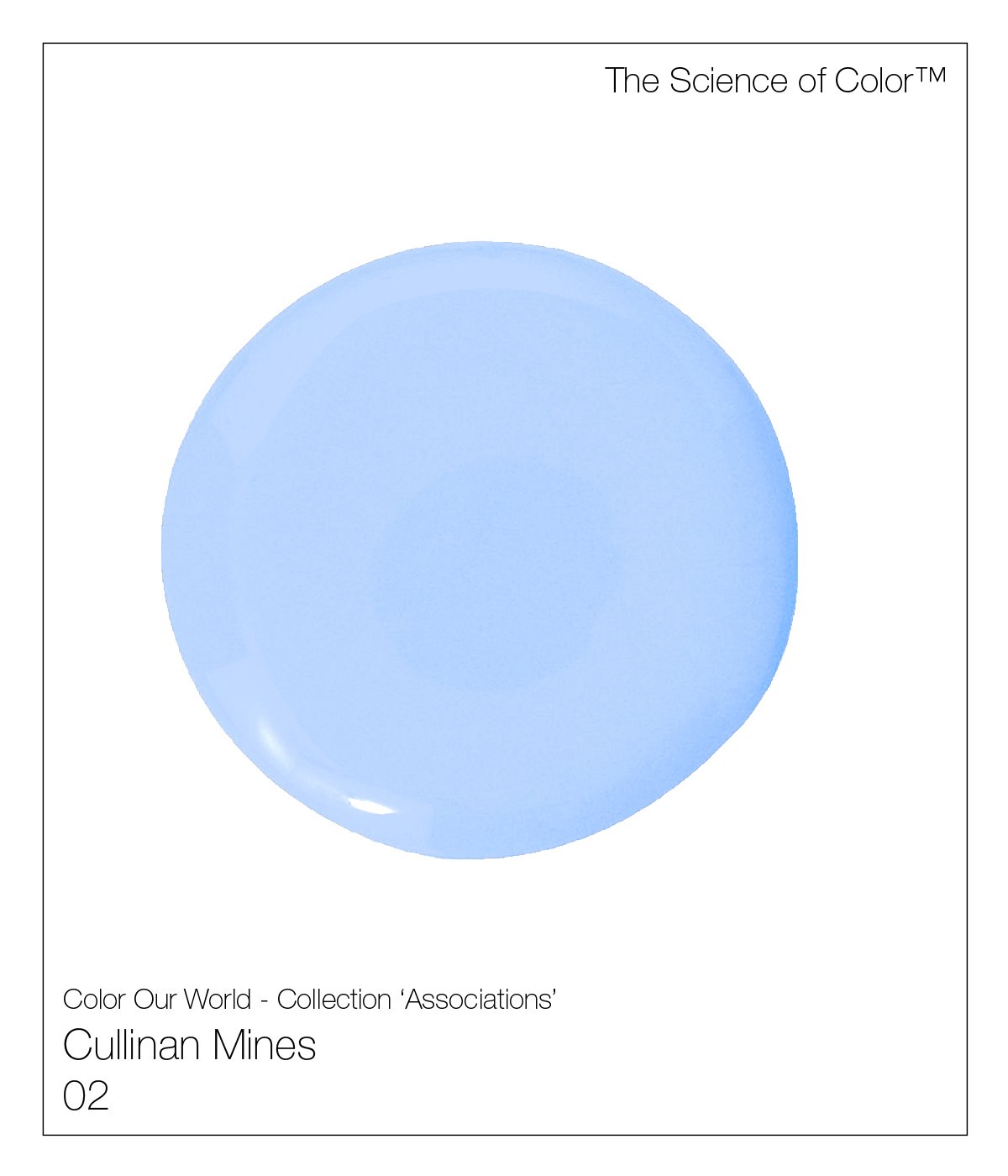
2. Cullinan Mines – Named after the most important Blue Diamond mines in the world, Cullinan, South Africa
Premier Color Palette


HOLLYWOOD HILLS COLLECTION